Loja International Festival of Scenic Arts | Brand redesign | Ministry of Culture & Heritage of Ecuador
Case of study
Context
Date: November 2021
Duration | The entire redesign proces: 3 months. The brand: Currently in use.
My role: Leader of the brand redesign
About the Festival
The International Festival of Scenic Arts of Loja, also known by its initials FIAVL, or simply "Festival de Loja", is an arts festival held in the city of Loja. This festival began in 2016, and since 2018 it has been recognized in Ecuador as a platform for the promotion of living arts and the expression of cultural rights at both the national and international levels. This recognition was granted through an institutionalization law issued by the National Assembly, which establishes its permanent celebration every November in the city after which it is named, Loja.
About the redesign
In 2021, for the 6th edition, due to the change in public administration and, above all, because of technical and symbolic reasons—such as the use of an isologotype featuring a harlequin (considered unsuitable for representing the living arts) holding a guitar inside the city’s name, along with the year and the festival’s name written in uppercase using a light typeface—several issues arose. These included the use of a texture in the figure and the letter A of the city’s name being filled with too many elements, making it less versatile and difficult to apply across different substrates.
With the new brand, the goal is to institutionalize the visual identity and graphics of the Festival so that it becomes timeless and enduring, with a global representation aligned with the living arts.
The redesign aims to be versatile in its application, in its reductions, and in the substrates where it is used. The result is simplicity, with both full and short versions, representing the movement and diversity of the living arts—an international image with a fresh touch that does not compromise its identity.

Problem Statement / Why the redesign was needed
-
Old isologotype with a harlequins was considered symbolically inappropriate for representing scenic arts in the broad spectrum of the definition.
-
The previous design had too many elements, making it less versatile and difficult to apply across various substrates and contexts.
Challenge
The existing festival identity relied on a literal pictorial symbol that did not effectively communicate the breadth or dynamism of performing arts and lacked versatility across mediums (print, digital, merchandising, signage). As a result:
-
Visual hierarchy was unclear and overly complex.
-
The brand system lacked flexibility for cross-platform use and scale.
-
There was limited visual coherence across festival touchpoints.

Design objectives
The primary objective of this project was to redesign the visual identity of the International Festival of Scenic Arts of Loja (FIAVL) in order to better represent the diversity, movement, and contemporary relevance of living arts, while ensuring long-term usability across institutional and promotional contexts.
Specifically, the project aimed to:
1. Brand Concept & Meaning
-
Move away from a literal, discipline-specific symbol toward a conceptual and abstract visual language capable of representing multiple forms of scenic and performative arts.
-
Create an identity that communicates movement, diversity, and artistic freedom without constraining interpretation.
-
Align the visual language with the festival’s cultural mission and contemporary positioning.
2. Flexibility & Scalability
-
Develop a modular and adaptable brand system that works across print, digital, environmental graphics, and large-scale applications.
-
Ensure the identity remains effective at different sizes, formats, and contexts, from small promotional materials to festival-wide signage.
-
Design a system that can evolve over time without losing recognizability.
3. Clarity & Recognition
-
Improve visual hierarchy and legibility to allow faster recognition in crowded cultural and institutional communication spaces.
-
Strengthen brand recall by establishing consistent visual patterns across all touchpoints.
-
Increase the festival’s visibility and differentiation within the regional and national cultural landscape.
4. Institutional Strength & Consistency
-
Reinforce the festival’s institutional presence while maintaining an accessible and contemporary tone.
-
Provide clear guidelines to ensure consistent application by different teams, partners, and collaborators.
-
Reduce visual fragmentation across communications by unifying all materials under a single system.
5. Operational Efficiency & Longevity
-
Create a timeless identity system that minimizes the need for frequent redesigns across future editions.
-
Support efficient production of communication materials through a structured, repeatable visual framework.
-
Enable the organization to scale its communications without increasing design complexity or cost.
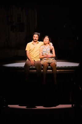

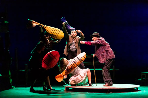
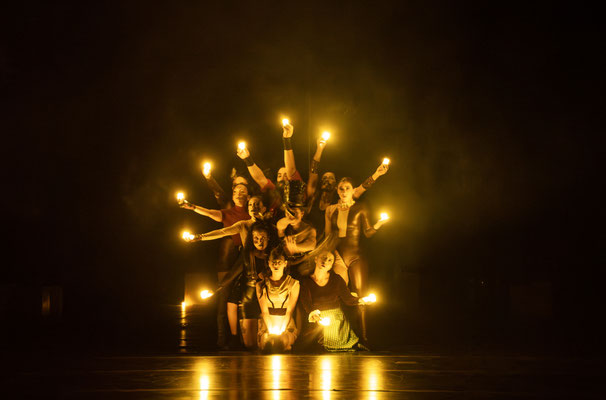
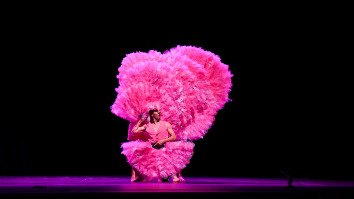
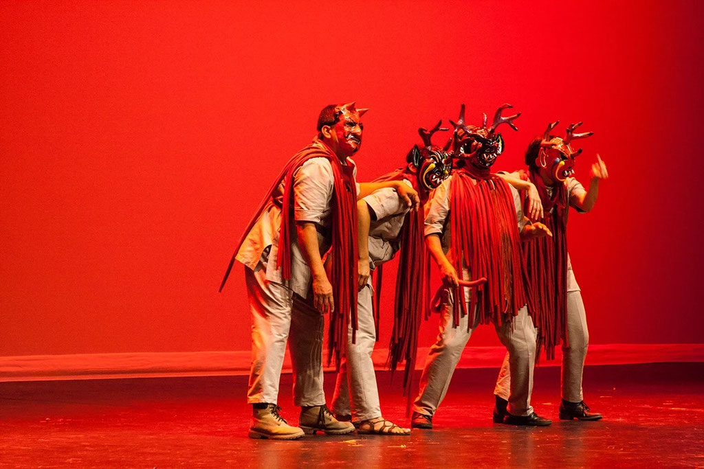
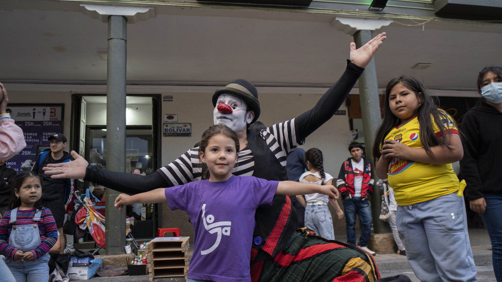
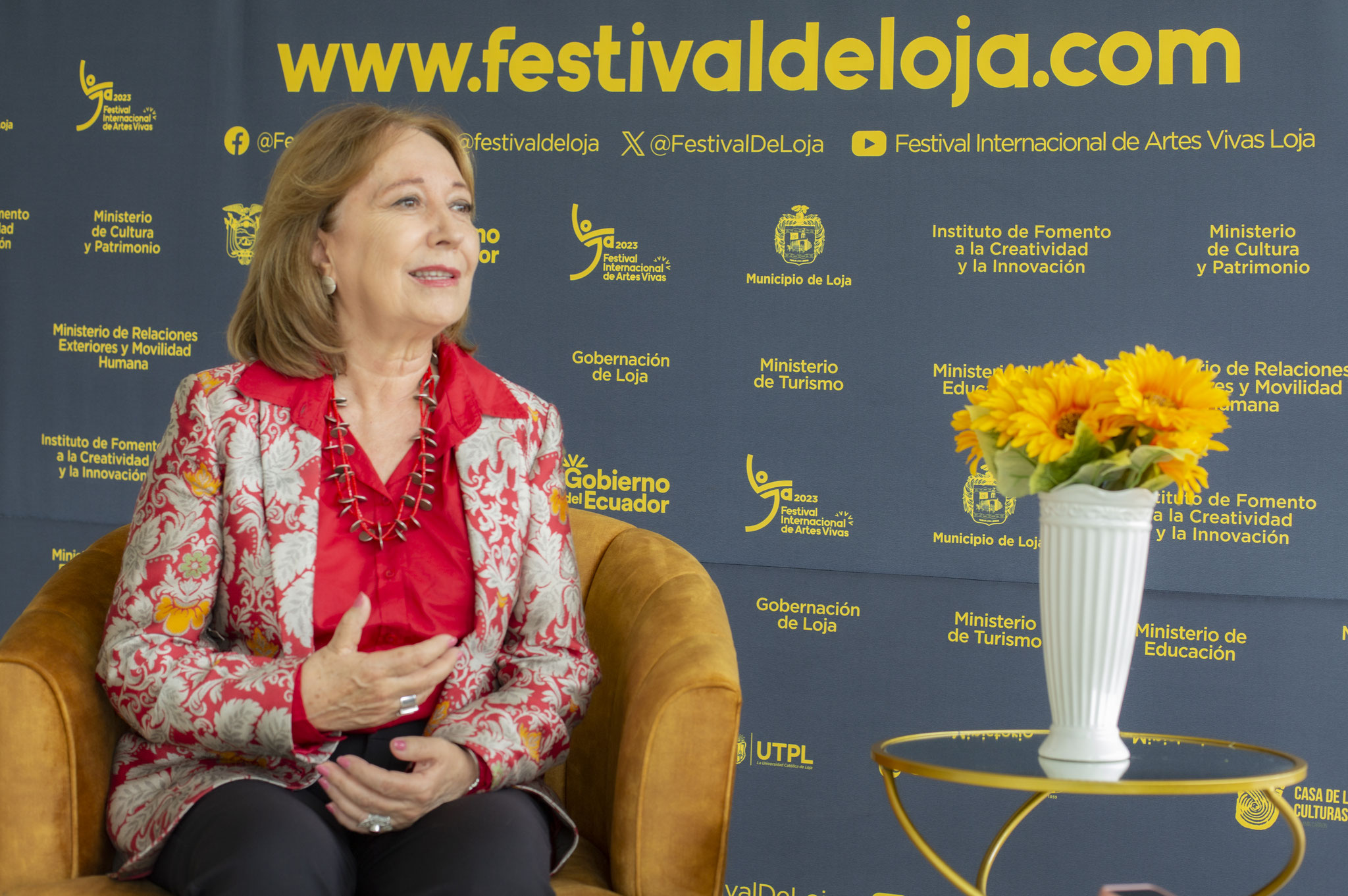
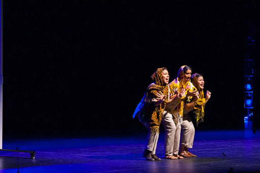
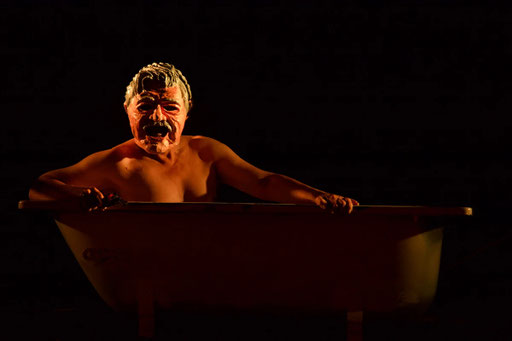
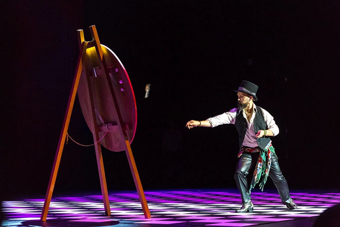
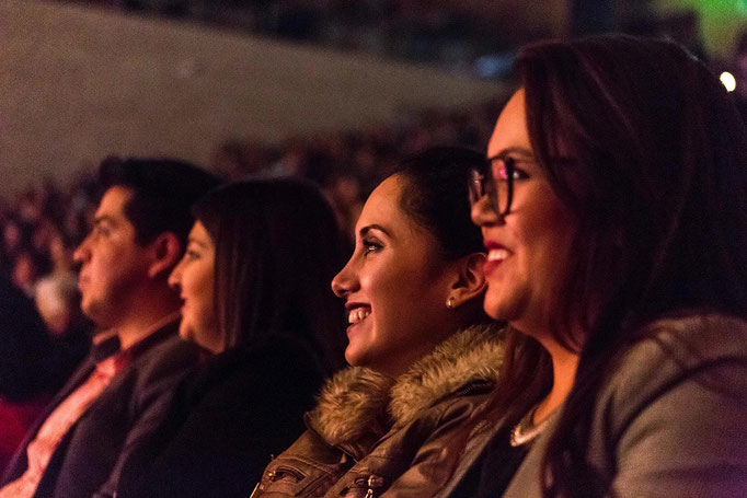
Images above: a galery of photographies from the last two editions
Design process
Approach
1. Audit and Research
Conducted a visual audit of prior festival branding and application contexts (posters, signage, digital assets). The audit highlighted limitations in flexibility and visual coherence.
History and evolution of the brand
-
The Festival’s brand has gone through three versions: 2016 first version, 2017–2020 second version, and 2021–present.
-
The first two versions lacked the most important qualities: versatility and long-term relevance.
-
The new brand was immediately embraced by the public. It is simpler, easier to apply across different products, and highly recognizable.
2016
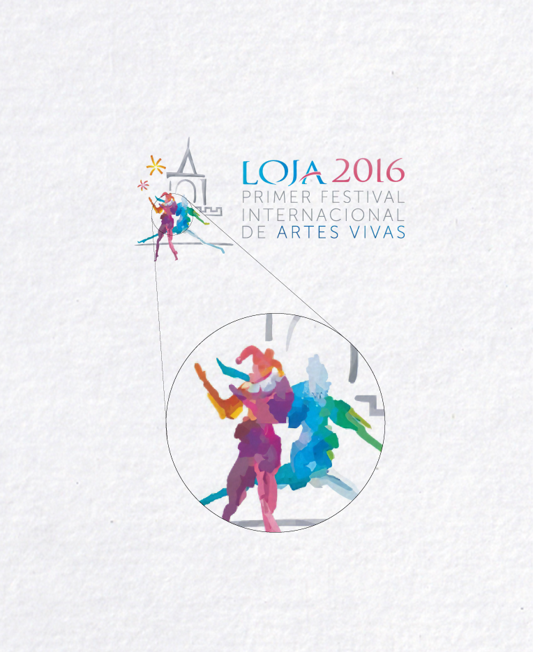
The first version of the brand featured an unnecessarily complex structure and composition, with an excess of elements that hindered its application across diverse graphic formats. It performed poorly at smaller scales, relied on a watercolor style that associated the brand with visual expressions unrelated to the performing arts, and used harlequins as a central symbol—an element that reduced the Festival and the performing arts to a simplistic, circus-like interpretation.
Legibility analysis: 6/10
✔️
- Main event name 'LOJA 2016' is readable with larger, distinctive font.
- Secondary information uses clean, modern typeface.
⚠️
- Watercolor effect and overlapping colors in the symbol make it visually busy near the text.
- The word 'LOJA' uses multiple colors and stroke styles, reducing clarity, especially at small sizes.
- Fine text ('PRIMER FESTIVAL INTERNACIONAL DE ARTES VIVAS') could become difficult to read at reduced sizes or from a distance.
Scalability analysis: 4/10
✔️
- Logo is impactful in larger applications like event banners, posters, and digital promotions.
⚠️
- Watercolor technique and multicolored human figures result in significant detail loss at small sizes (e.g., merchandise, pins, website favicons).
- Thin text and delicate strokes do not lend themselves well to embroidery or small product labels.
- Complex illustration does not reduce easily for industry-specific mockups such as ticket stubs or small festival branding materials.
Color harmony analysis: 4/10
✔️
- Colors feel lively and communicate a celebratory message.
⚠️
- Overuse of colors (more than four) detracts from unity—palette is overwhelming.
- Gradient and multicolor presentation may not reproduce well in all formats.
- Some color overlaps reduce legibility.
2017-2020
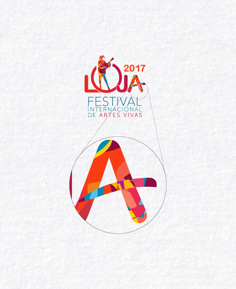
The second version continued to rely on the harlequin as a symbol of the performing arts, while introducing a guitar that lacked conceptual justification. Additional elements were incorporated into other parts of the brand—such as the letter “A”—further complicating its application across different formats and maintaining poor performance at smaller scales. However, the inclusion of the word “Loja,” the name of the city, marked an important step toward strengthening citizens’ identification with the Festival.
Legibility analysis: 6/10
✔️
- Main event title 'FESTIVAL INTERNACIONAL DE ARTES VIVAS' is clear and easy to read.
- '2017' date is legible in red, drawing the eye.
⚠️
- 'LOJA' is partially obstructed by the guitar player illustration, especially the 'O' and 'A', reducing instant recognition.
- Too many typographic styles and colors competing in 'LOJA'.
Scalability analysis: 4/10
✔️
- Boldness of 'LOJA' offers some readability at medium scale.
- Main event subtitle in clean sans-serif is adaptable.
⚠️
- Intricate illustration loses details at small sizes (e.g., favicon, small merchandise).
- Color blending and overlapping in 'LOJA' would reproduce poorly in embroidery or monochrome.
- Too complex for scalable signage or compact applications.
Color harmony analysis: 4/10
✔️
- Diverse palette suits the arts theme.
⚠️
- Too many saturated colors used at once, making the logo visually noisy.
- Limited contrast between overlaid colors in 'LOJA'.
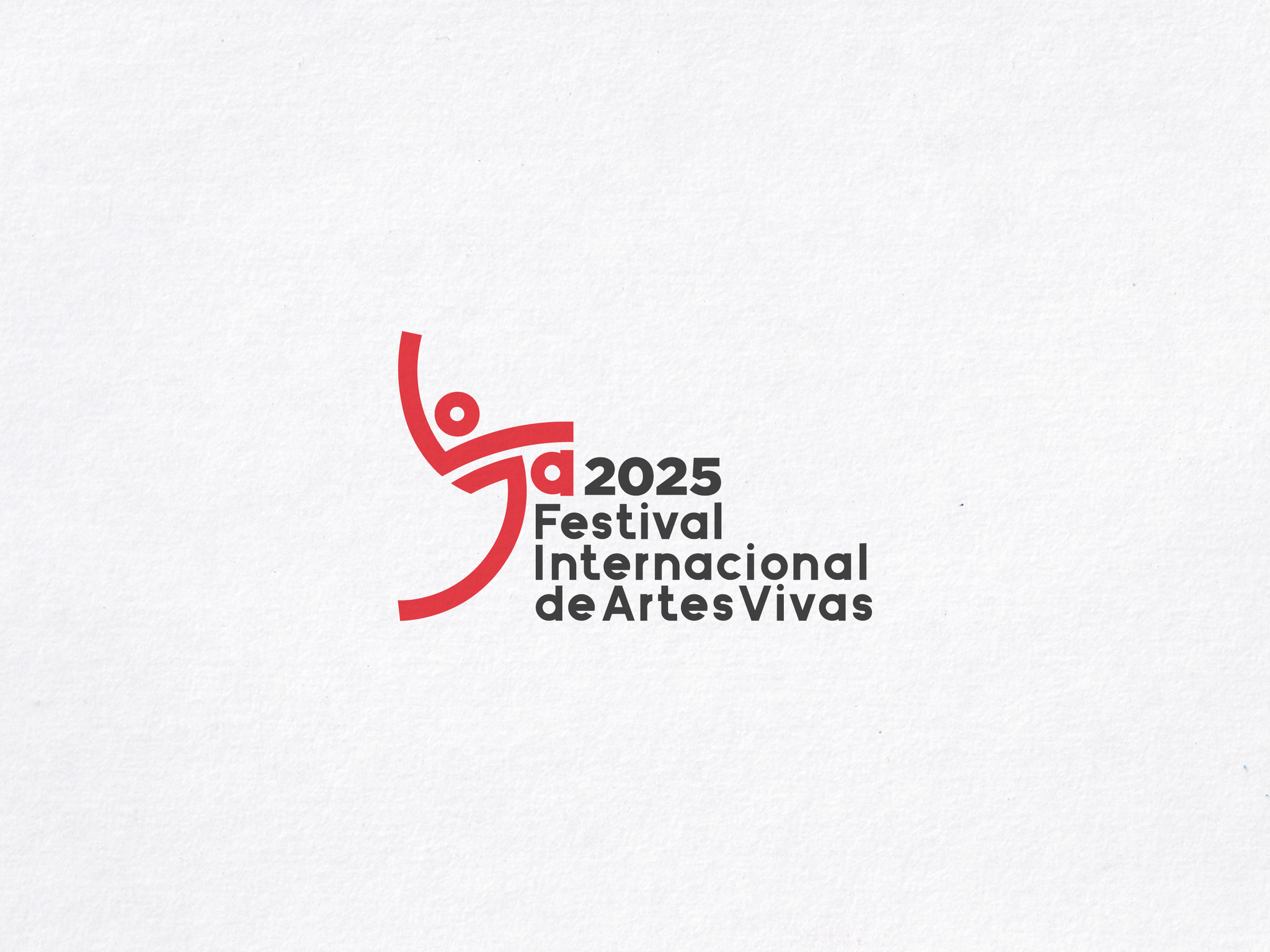
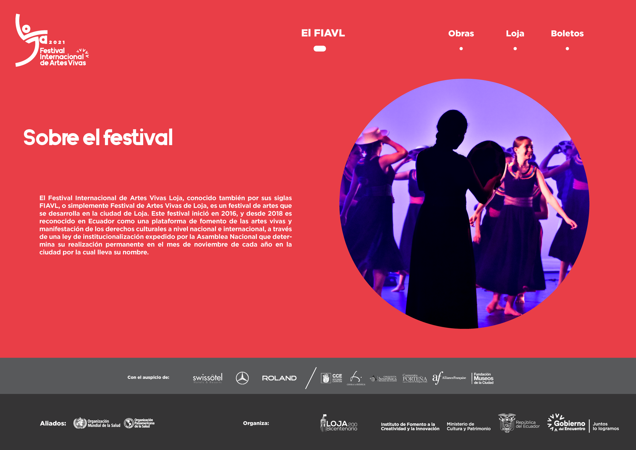
2021-current
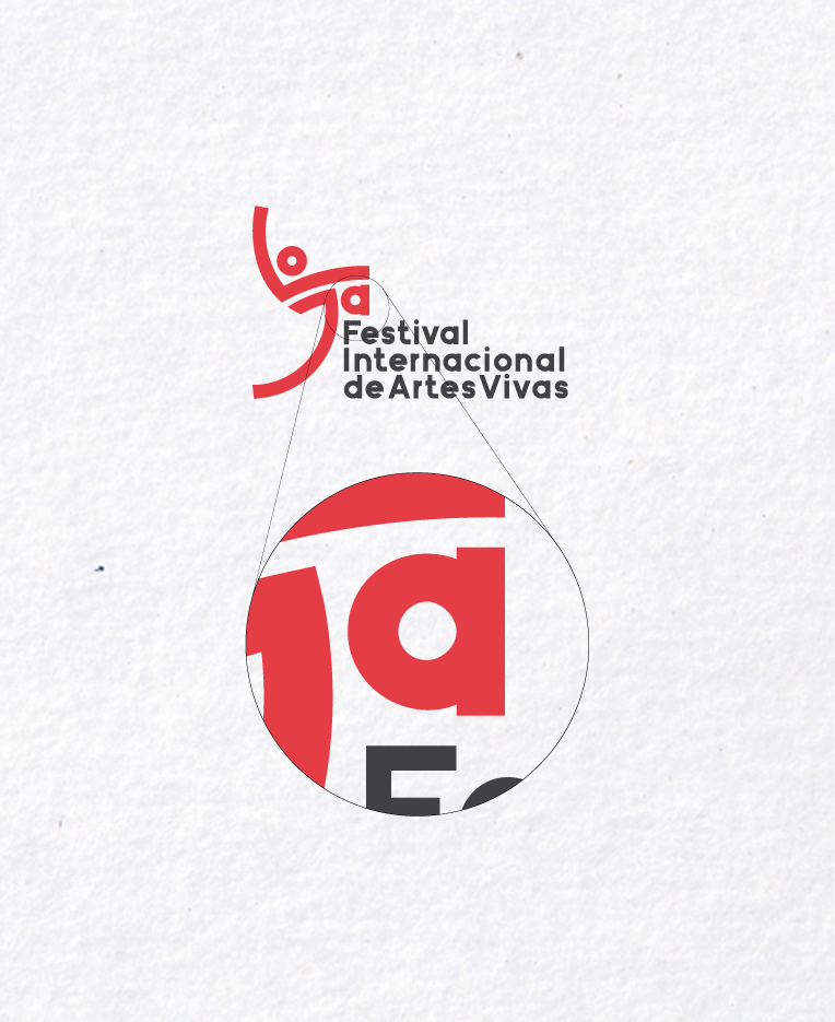
The redesigned and current brand eliminated all previous elements and symbols while retaining the word “Loja” as the brand’s primary element, in accordance with the requirements and brief established for the development of the new identity.
Legibility analysis: 10/10
✔️
- Text is clear, well-spaced, and uses a highly readable sans-serif typeface.
- Hierarchy is established with bolding for 'Festival Internacional' and slightly lighter 'de Artes Vivas.'
Scalability analysis: 8/10
✔️
- Symbol remains recognizable at relatively small sizes.
- Works well in horizontal and vertical formats for posters, web, and signage.
⚠️
- Thin lines in the icon could get lost in very small applications like favicons or embroidery patches but as we shall see later this new brand has simplified versions to aboid this problems.
- Two-color application may have contrast issues against some backgrounds and for that reason the brand guidelines has one color and negative versions to preserve contrast over backgrounds.
Color harmony analysis: 410/10
✔️
- Diverse palette suits the arts theme.
⚠️
- Two-color palette is harmonious and provides effective contrast.
- Palette is modern, energetic, and suitable for artistic events.
2. Concept and Development
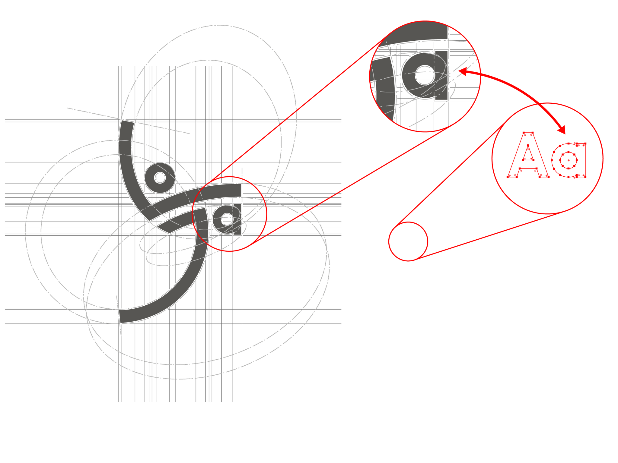
Focused on visualizing movement and diversity — fundamental attributes of living arts — through abstract forms inspired by performative gestures, textures, and modular shapes.
One of the most important requirements was to keep the word "Loja" present in the brand.
Through different approaches—including research, analysis, brainstorming sessions, and exploratory essays—the main conceptual objective was to represent the performing arts in a non-literal manner. Rather than relying on explicit or figurative symbols, the intention was to develop a neutral and abstract visual language in which the presence of the human silhouette could gain greater relevance. This approach allowed the identity to evoke movement, expression, and performance without falling into restrictive or misleading interpretations. At the same time, the concept prioritized a simpler and more controlled construction, ensuring greater clarity, versatility, and adaptability across different applications and formats.
Loja
Loja is a city in southern Ecuador, known as the country’s cultural capital for its music scene. In the city center, the Museum of Music displays instruments and original scores. Nearby, Park de la Independencia San Sebastien is lined with colonial buildings with wooden balconies. At the base of the clock tower (torre de reloj) in the middle of the square are reliefs that depict important episodes of Loja’s history.
Scketching
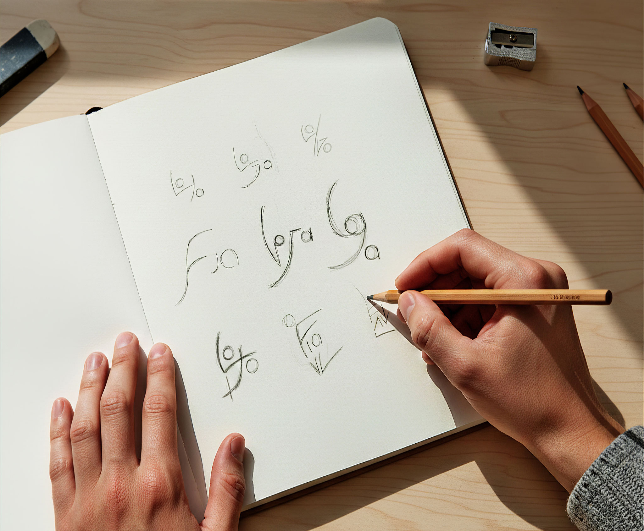
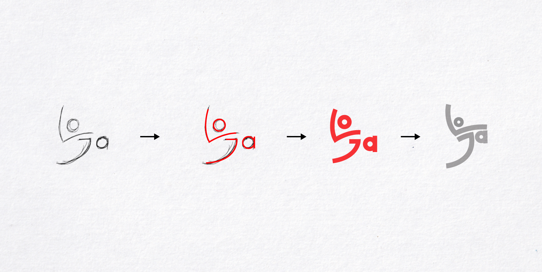
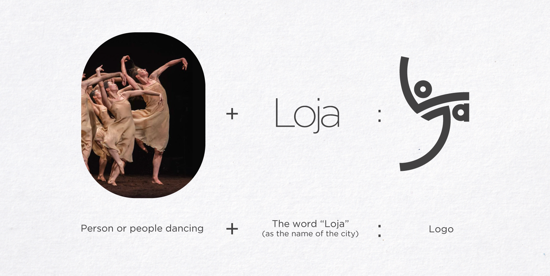

Image above: geometric simplification

Image above: analogy

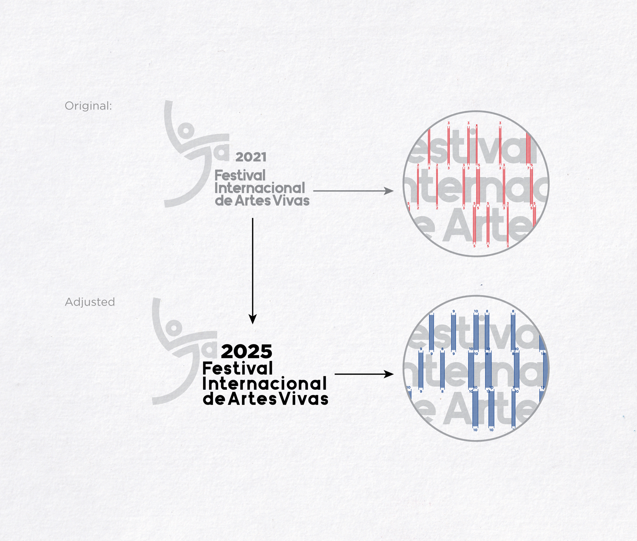
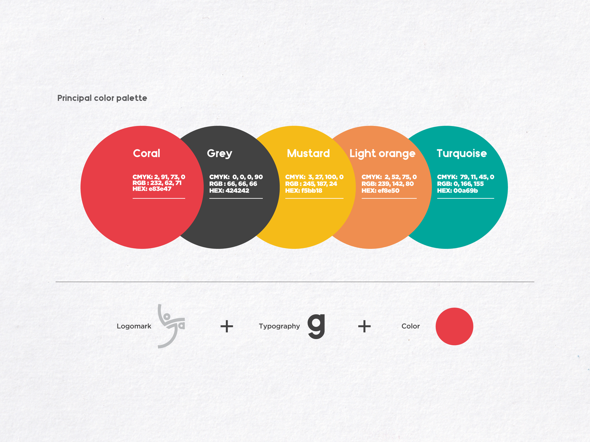
3. Typography & Color Strategy
The typographic and color systems were designed to reinforce the conceptual nature of the identity while ensuring clarity, versatility, and strong visual recognition across all applications.
Typography:
Based on the shapes and forms of the logomark—characterized by geometric elements such as a perfect circle used for the letter “o” and the body of the letter “a” (a key factor in determining the typographic direction)—I conducted a typographic exploration to identify a typeface that aligned with these forms. The objective was to achieve a harmonious interaction between the logomark and the typography.
Other criterias I used to choose the correct typeface:
-
A contemporary, highly legible typeface to support both institutional communication and expressive festival materials.
-
The typographic system balances structure and flexibility, allowing it to function consistently across editorial layouts, posters, digital content, and signage.
-
Hierarchy, spacing, and scale were carefully defined to ensure clarity in both information-heavy and more experimental compositions.
Zilap Universal Semi-Bold
As we can see, after the research and study of multiple typographies, an looking for the best match for the brand, the font choosed was the Zilap Universal Semi-Bold, selected for its geometric sans-serif construction, characterized by circular counters, uniform stroke weight, and controlled proportions. The rounded forms of characters such as o and a visually correspond with the geometric strokes of the festival’s logomark, reinforcing structural consistency between symbol and typography. Its low contrast, open apertures, and solid x-height ensure high legibility across scales and formats, while the Semi-Bold weight provides sufficient visual presence for institutional and promotional applications without compromising clarity or flexibility within the brand system.
Cohesion with the logomark:
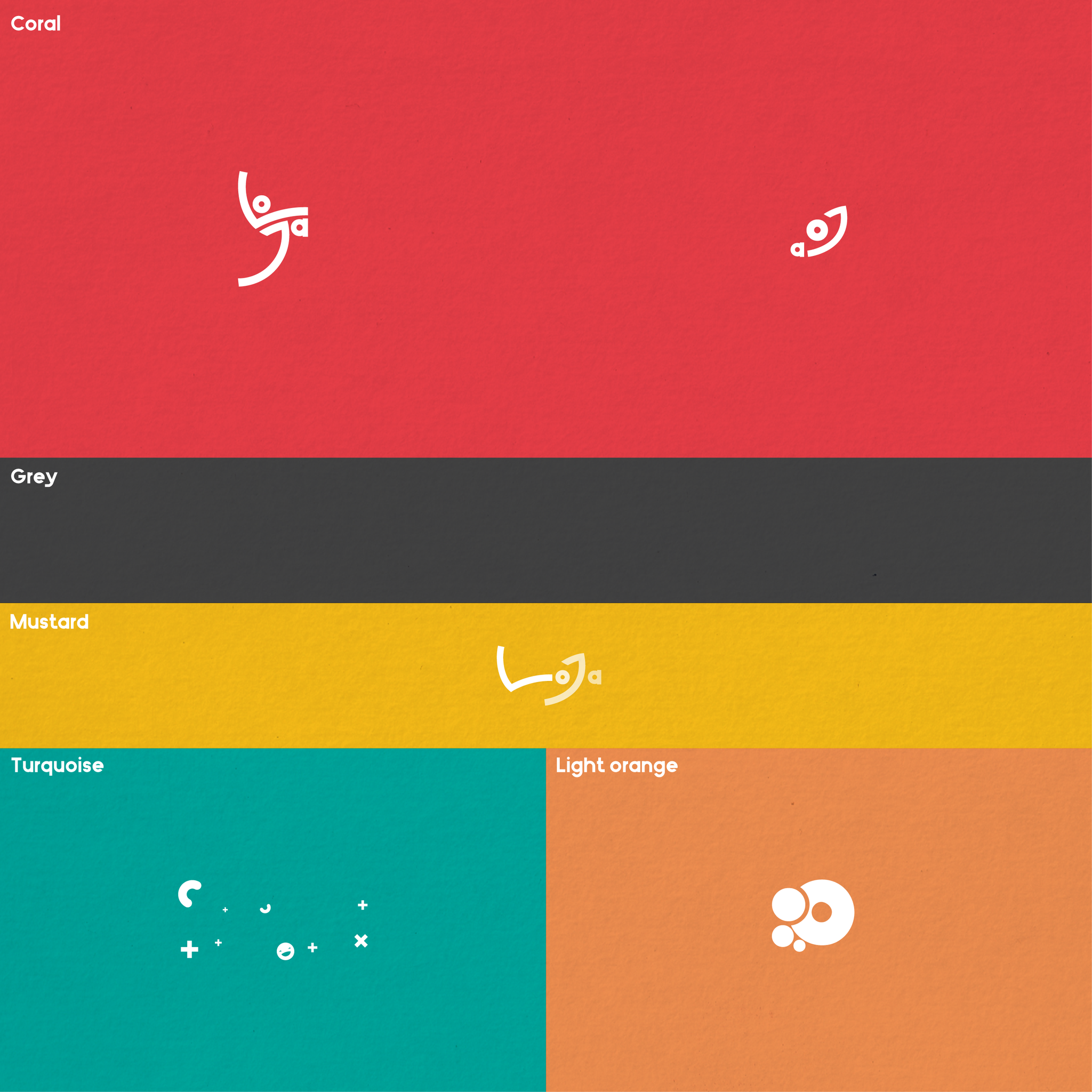
Color
-
Based on the previous chromatic of the older versions of the brand, the color palette was conceived as a dynamic system rather than a fixed set of combinations, enabling variation without losing coherence.
-
Strong contrasts were prioritized to ensure visibility in diverse contexts and formats.
-
Color was used as an expressive tool to convey energy and movement, while maintaining enough restraint to preserve institutional credibility.

4. Logo System Design
The logo system was developed as a flexible and modular identity framework capable of adapting to the diverse communication needs of the festival while maintaining strong visual recognition.
- The system is built around a primary logomark supported by secondary and auxiliary versions, allowing the identity to function effectively across different formats, scales, and contexts. Clear rules were established for spacing, proportions, and alignment to ensure consistent application across print, digital, and environmental graphics.
- The logo system also supports dynamic compositions, allowing the logomark to interact with color, typography, and graphic elements including sub-brands (known as components by the organizers of the Festival) while preserving its core structure. This approach ensures adaptability for expressive festival products while retaining enough coherence to support institutional communication.
- Overall, the system prioritizes versatility, consistency, and longevity, allowing the identity to evolve across different editions of the festival without compromising recognition or visual integrity.
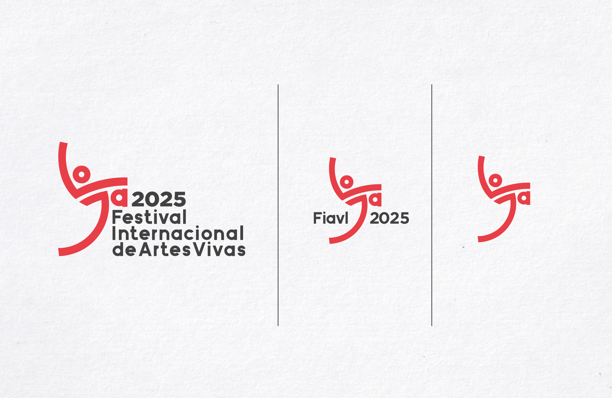
At the left - Main version: used on all products and contains the complete brand identity.
At the center - Secondary version: used in narrow products and graphic applications.
At the right - Minimal version: for small spaces where the text can be omitted
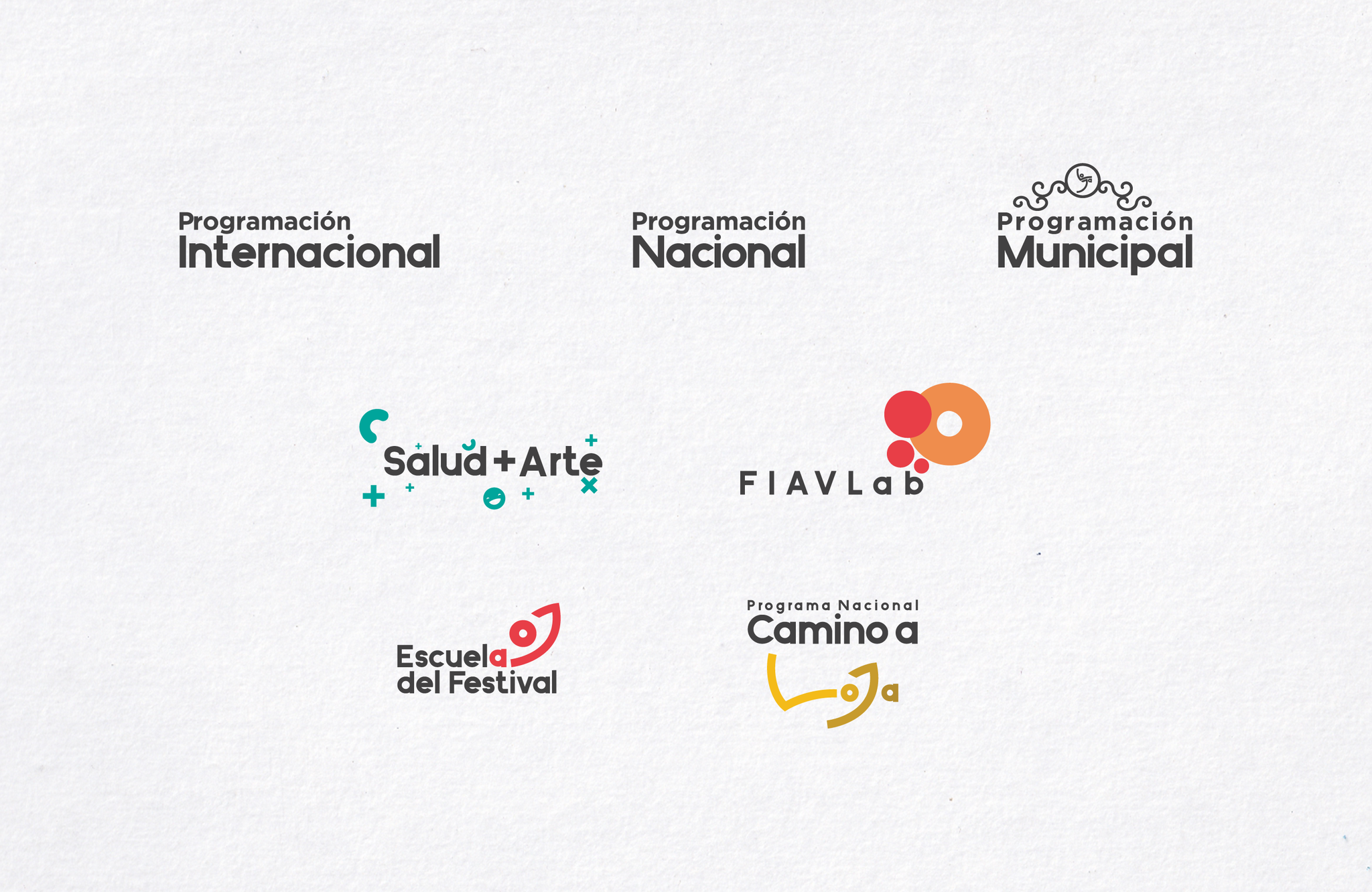
Components of the Festival
The International Festival of Living Arts Loja (FIAVL), as a performing arts event, is a multicultural initiative focused on diverse forms of performative arts. It is structured into distinct components developed by various organizations, each with a specific role. Each component is designed to engage different audiences and to address distinct objectives related to dissemination, circulation, and cultural and psychological benefit, based on the following structure:
-
International Program
Internationally invited companies and artists from different parts of the world present their most outstanding works, ensuring a unique and diverse artistic experience. -
National Program
This program features the most impactful multidisciplinary artistic proposals from Ecuador, selected through an open public call organized by the Ministry of Culture and Heritage. These works align with a curatorial concept that reflects emerging expressions and contemporary artistic languages. -
Municipal Program
Led by the Municipality of Loja, this program offers a broad cultural agenda presented through a high-level lineup. It is primarily implemented in non-conventional public spaces throughout the city, forming part of a cultural circuit. -
Road to Loja Program
This component is an itinerant and decentralized showcase of FIAVL, featuring a selection of artistic expressions presented prior to each edition in different provinces across the country, and later converging in Loja with performances in November. This program is developed in coordination with the Ecuadorian House of Culture Benjamín Carrión and its regional branches. The ninth edition of FIAVL 2024 will pay tribute to Ecuador’s rich Afro-Ecuadorian heritage. It is funded by the Institute for the Promotion of Creativity and Innovation. Art, in its various expressions, provides valuable tools that contribute to both mental and physical health, making it fundamental to social development. -
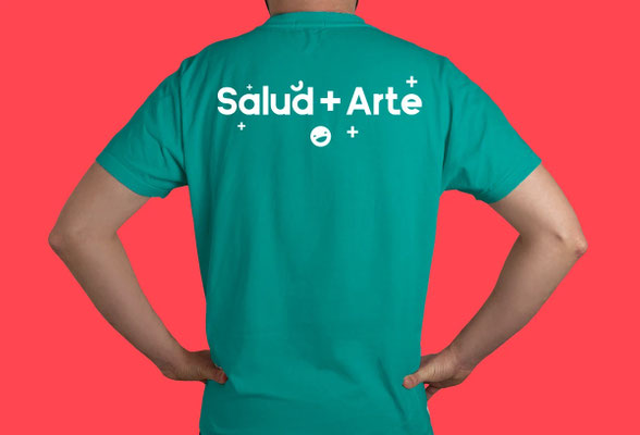
HEALTH + ART Program
Launched in 2021, this program aims to provide experiences and spaces for connection and learning that improve the quality of life of people in priority care groups and vulnerable situations. It is supported by the World Health Organization and the Pan American Health Organization (WHO/PAHO), the Institute for the Promotion of Creativity and Innovation, and various institutions within the National Cultural System, including the Loja Symphony Orchestra. -
Festival School Program
This program is a permanent space for pedagogical development and professionalization in the arts, offering workshops, talks, and showcases. All activities are designed to strengthen the capacities of students, artists, and the general public at a national level. It is funded by the Institute for the Promotion of Creativity and Innovation. -
FIAVLab Program
FIAVLab is a non-formal educational space that fosters the exchange of experiences, knowledge, practices, and performances among artists, cultural managers, students, and interested audiences during each edition of the festival.
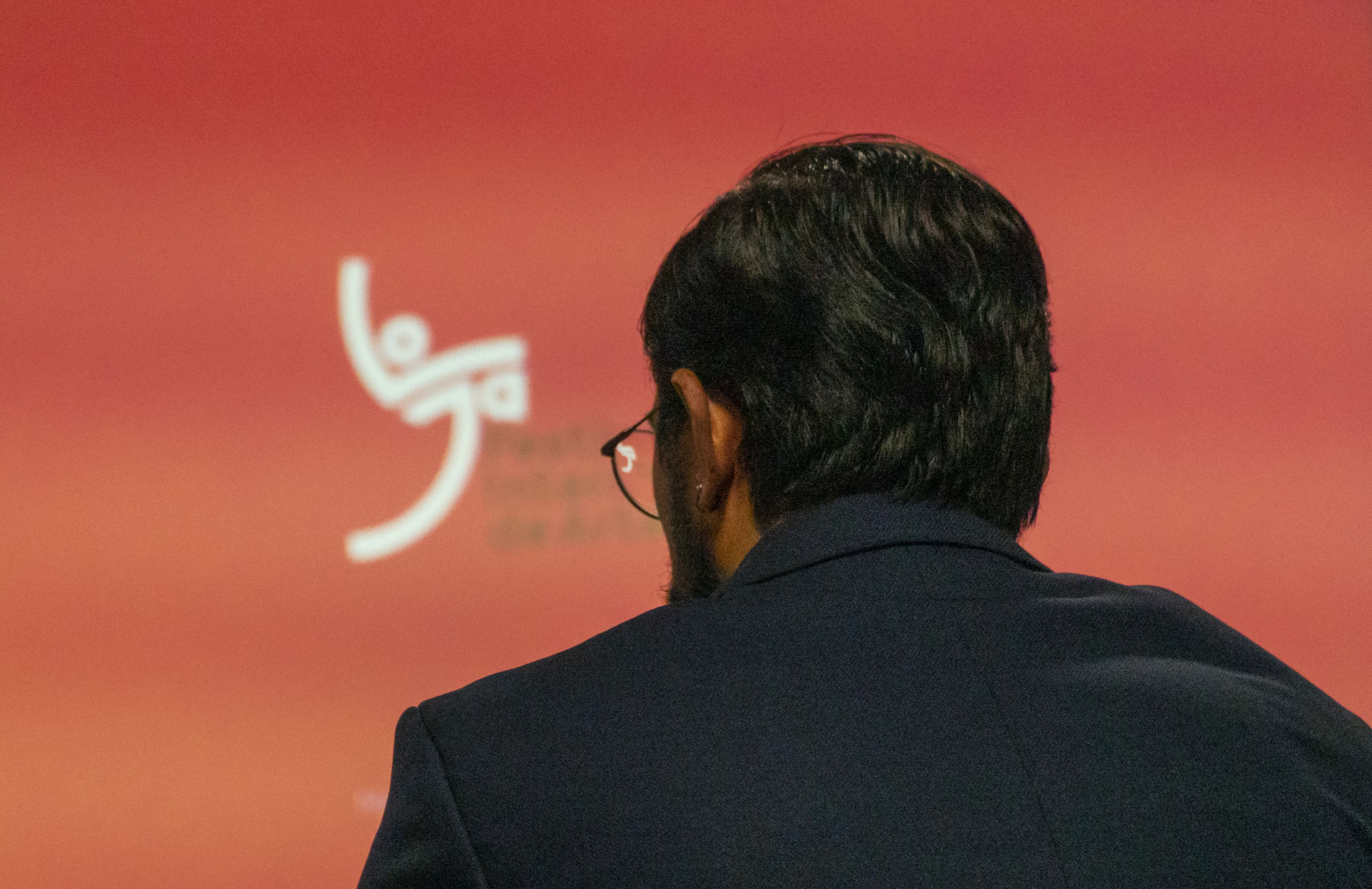
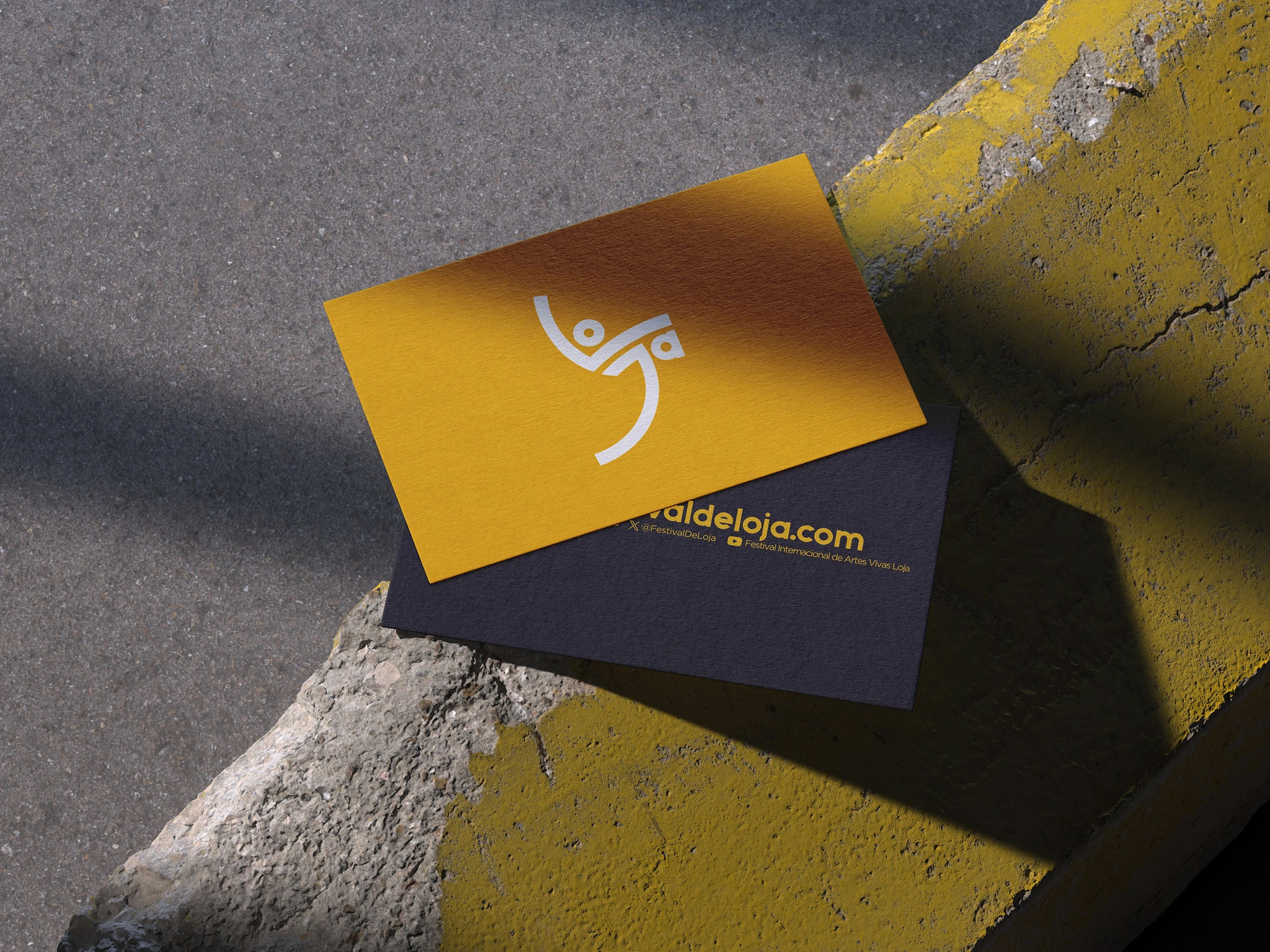
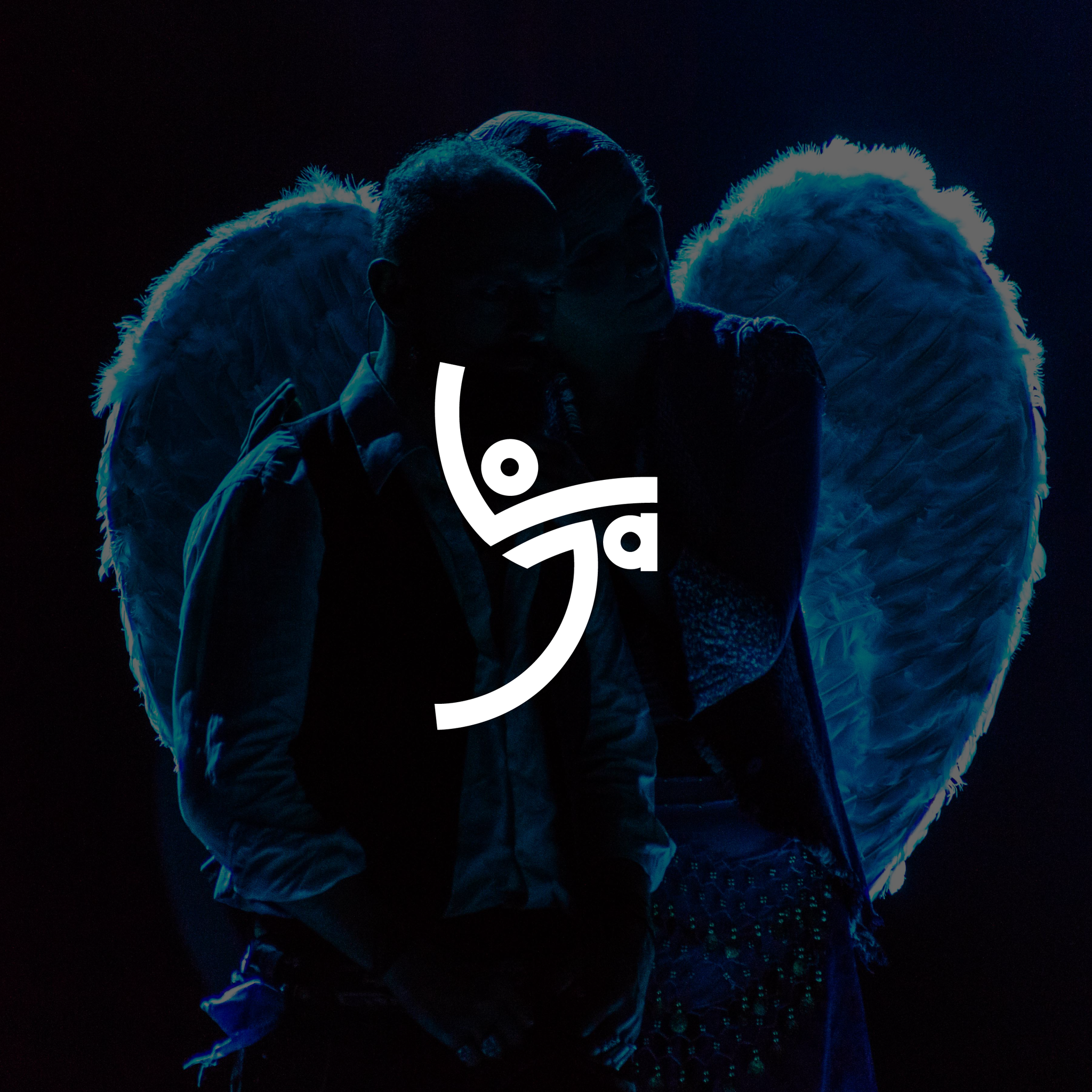
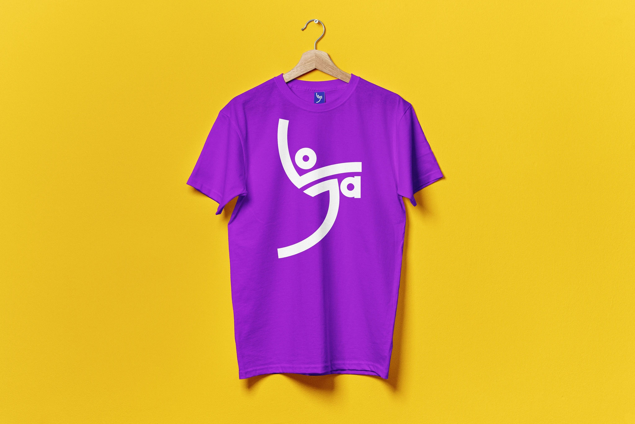
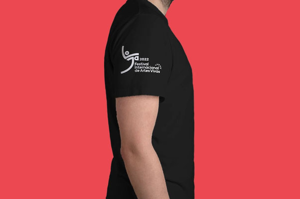
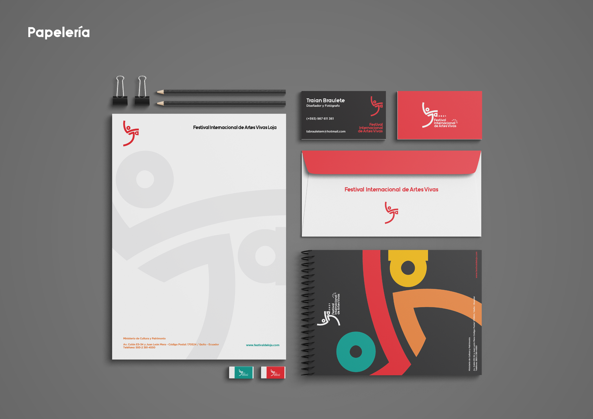
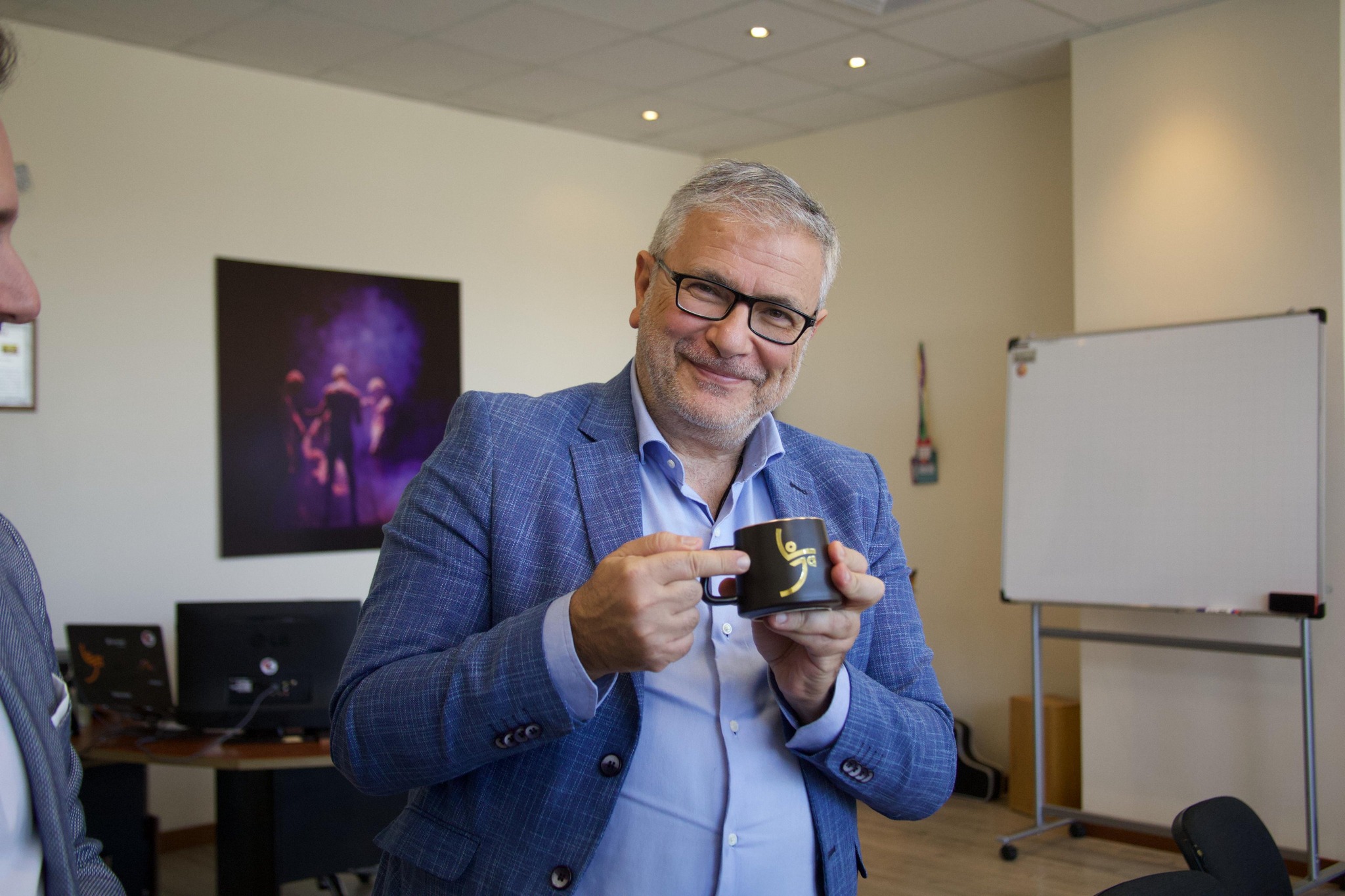
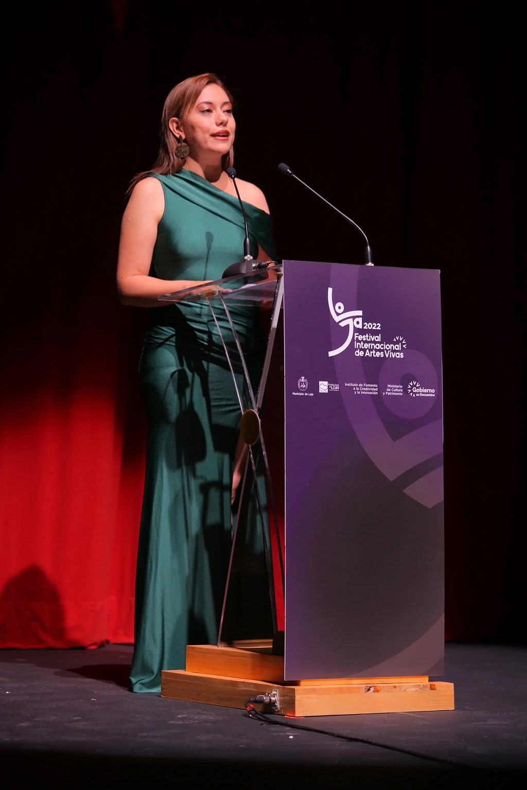
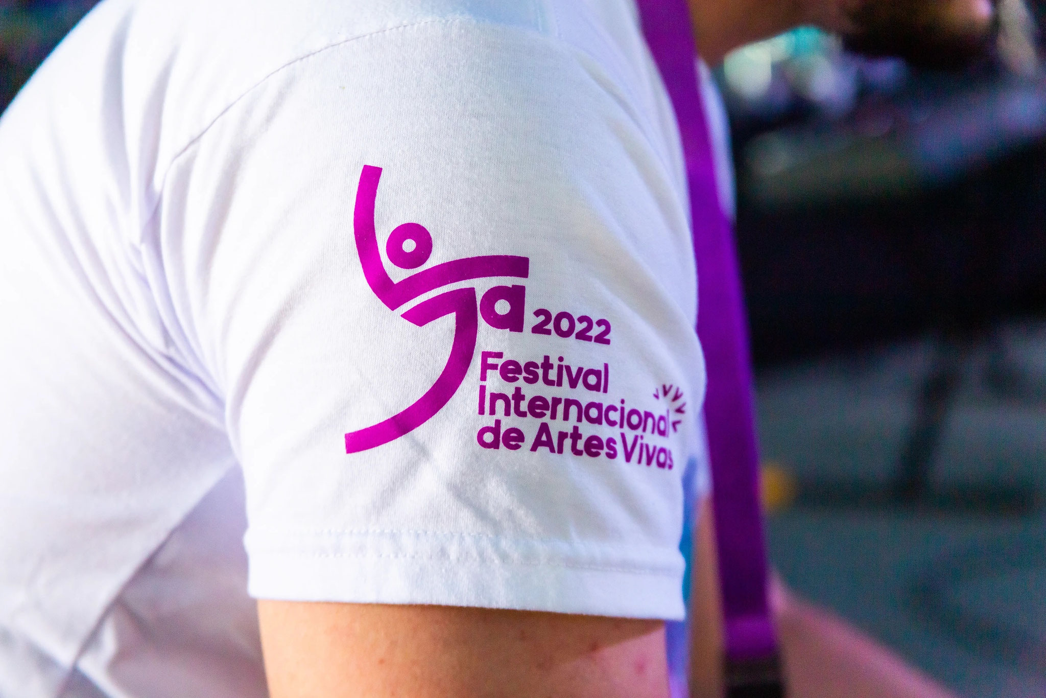
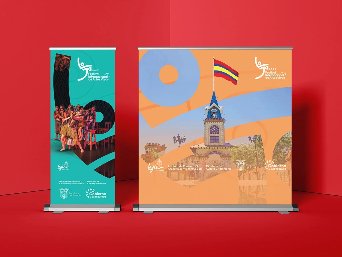
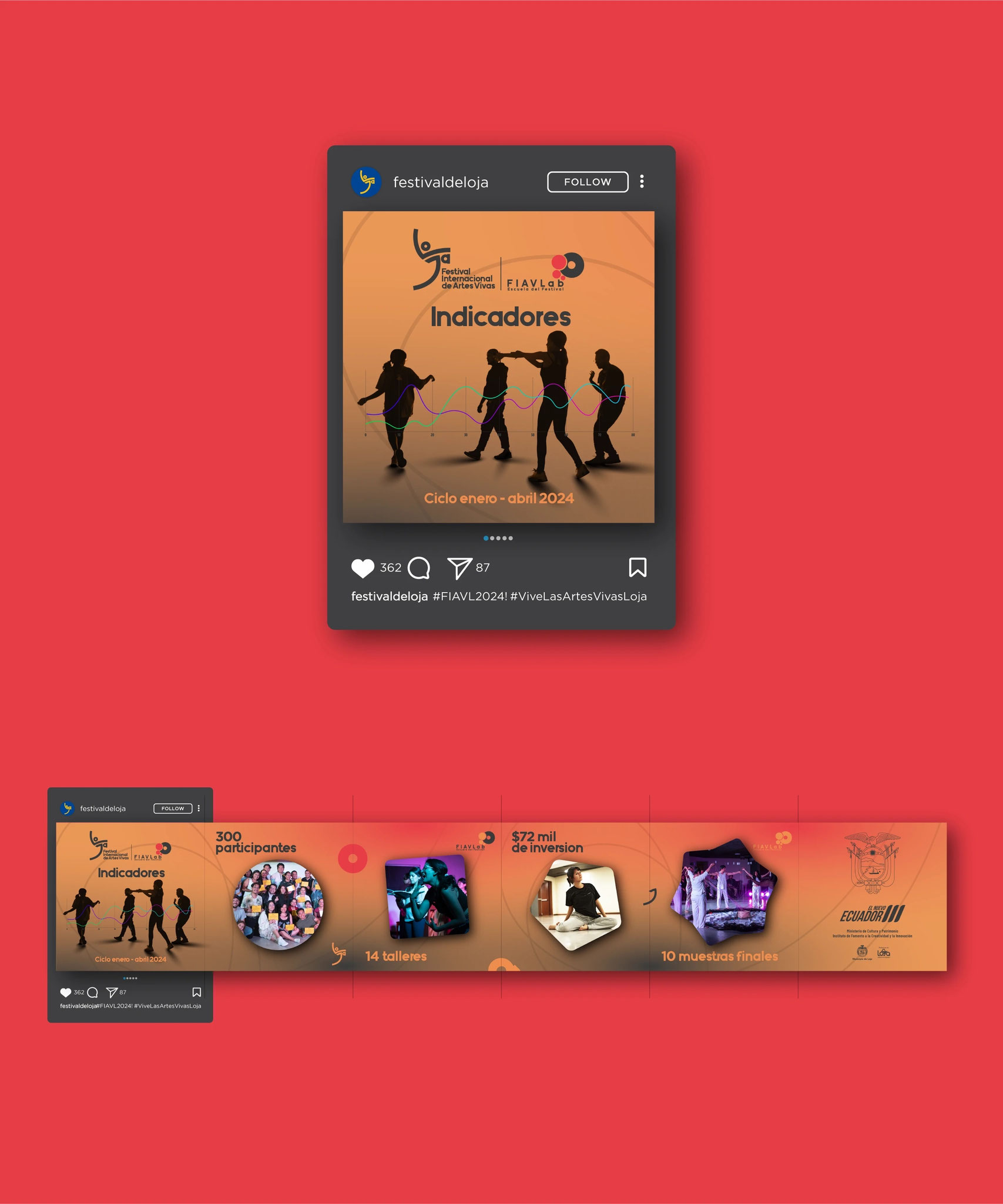
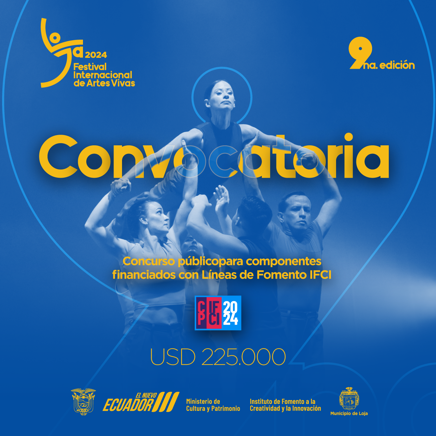
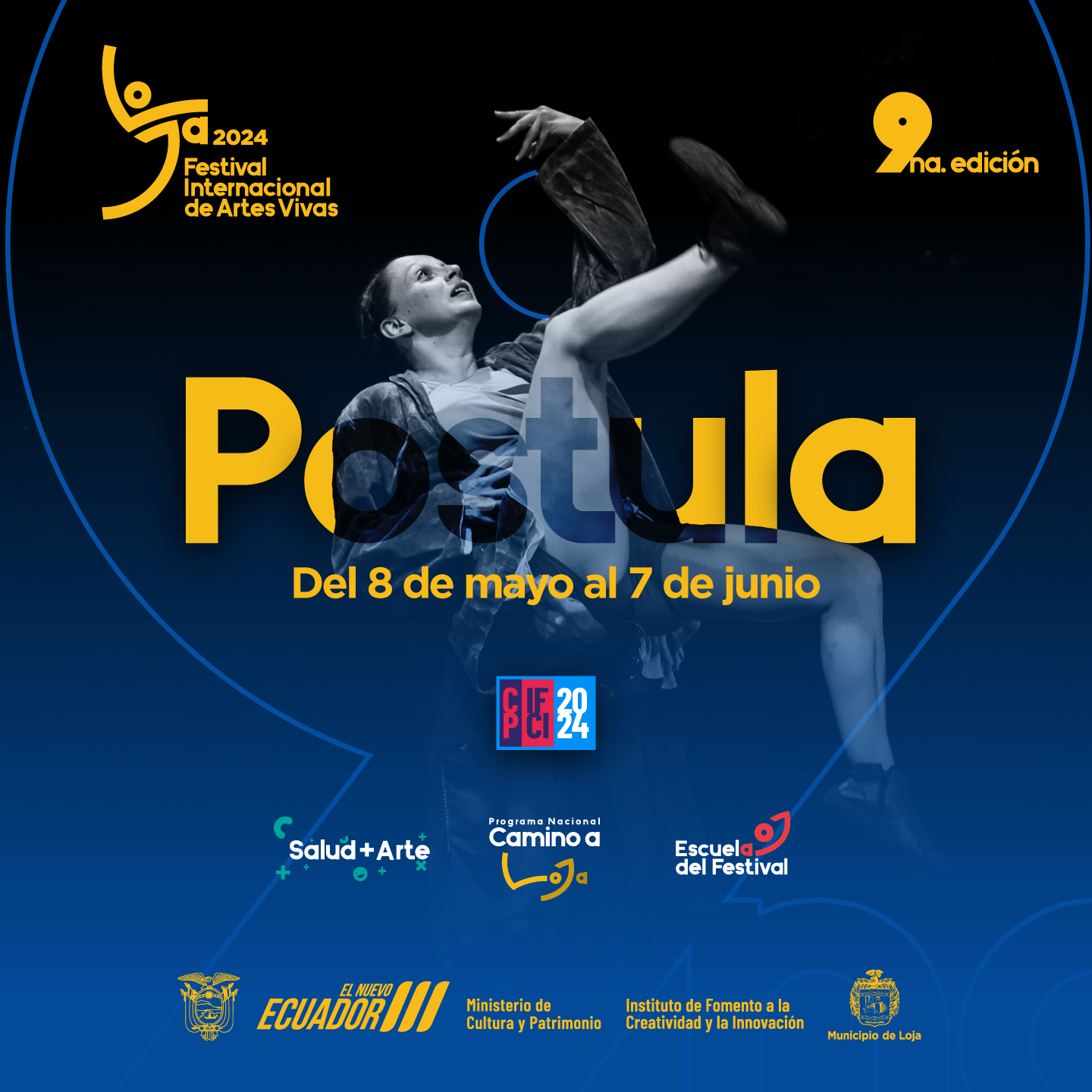
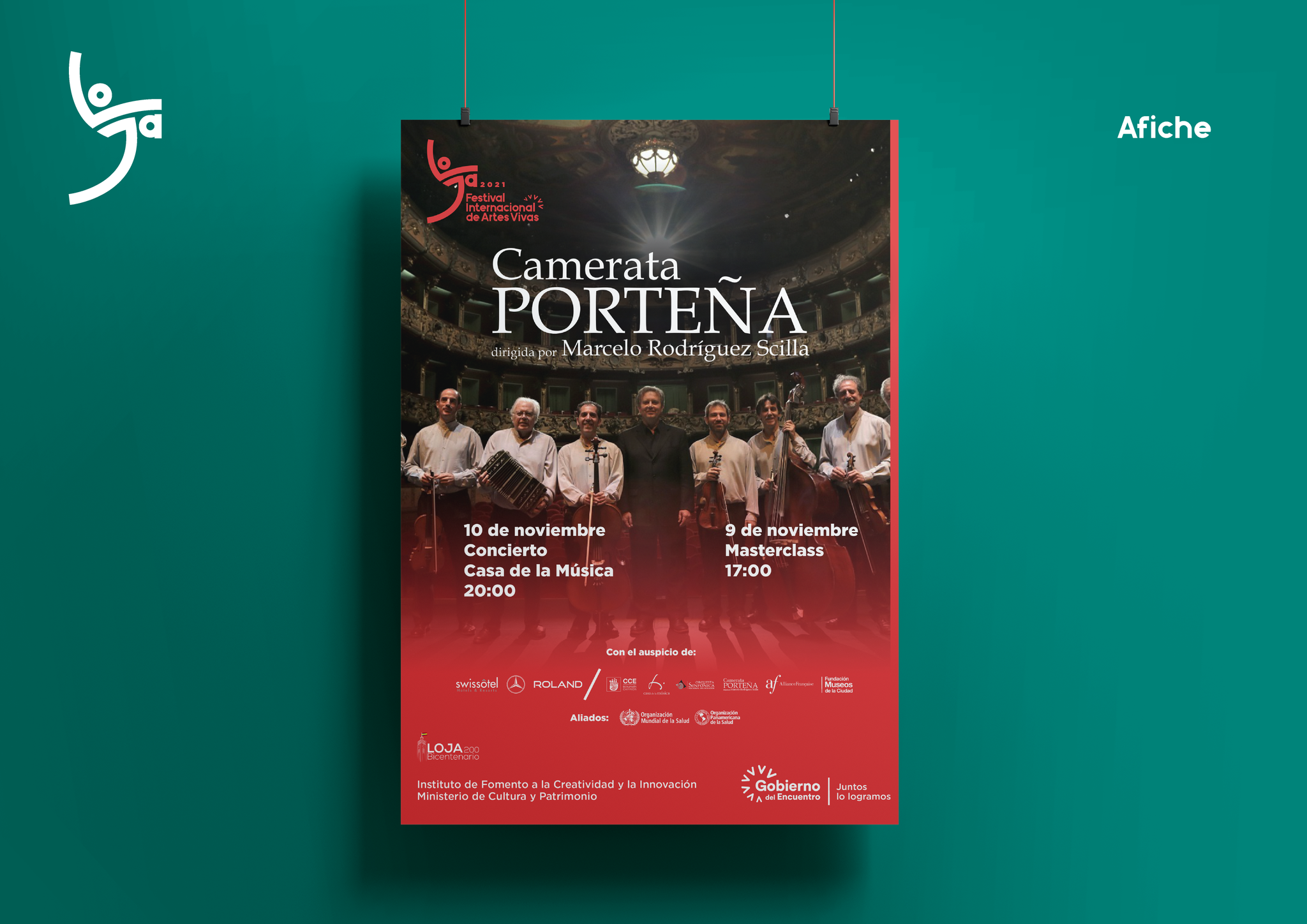
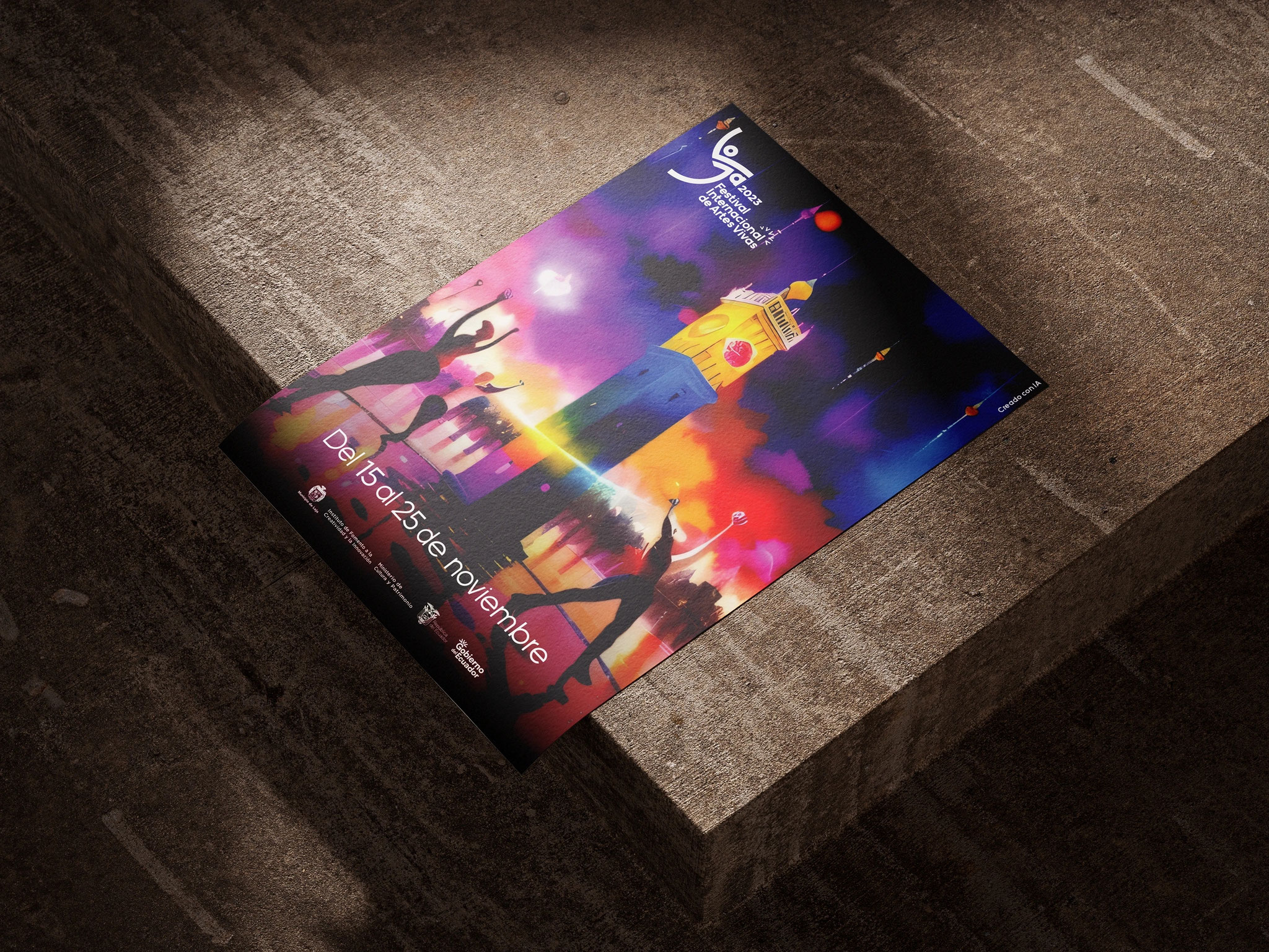
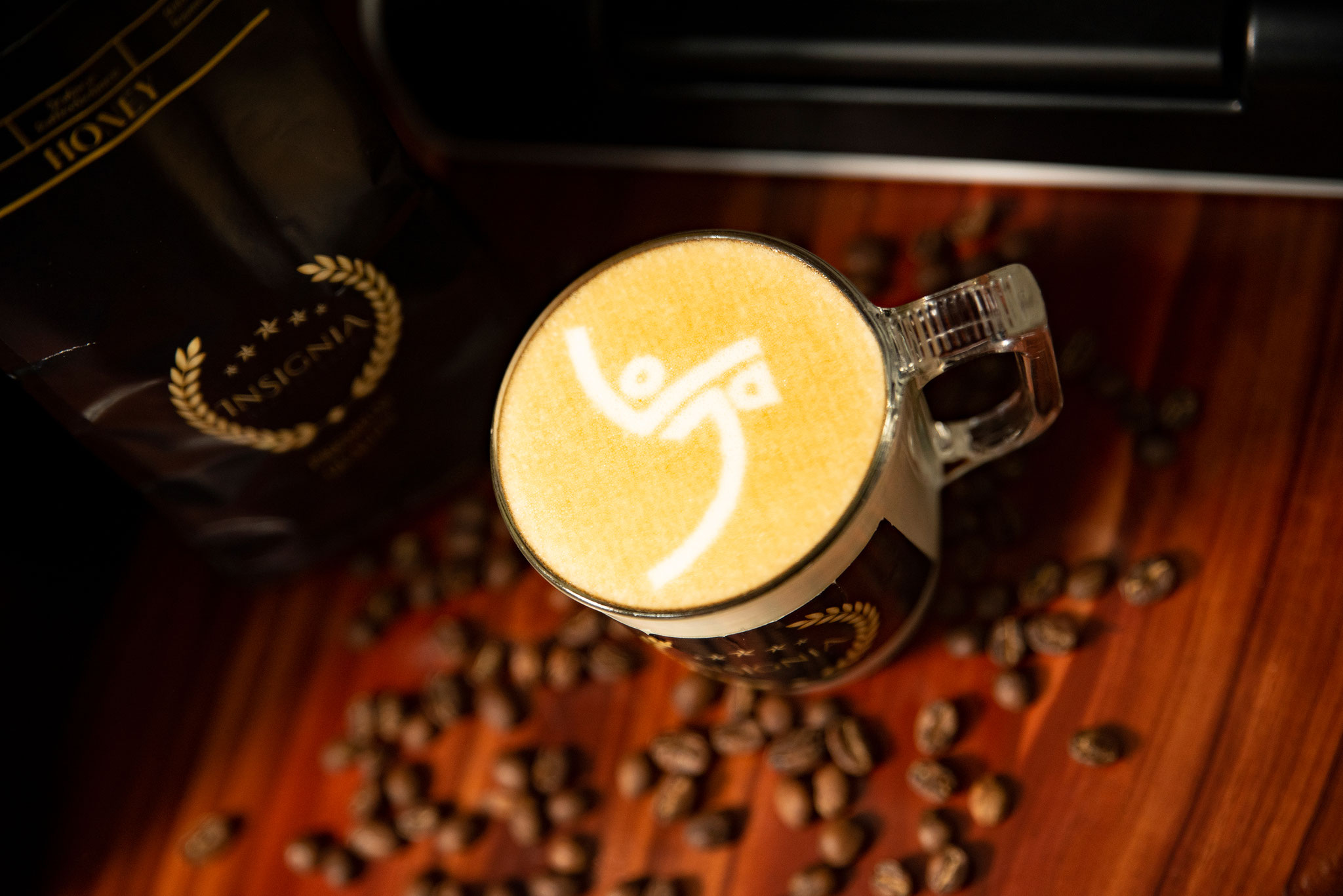
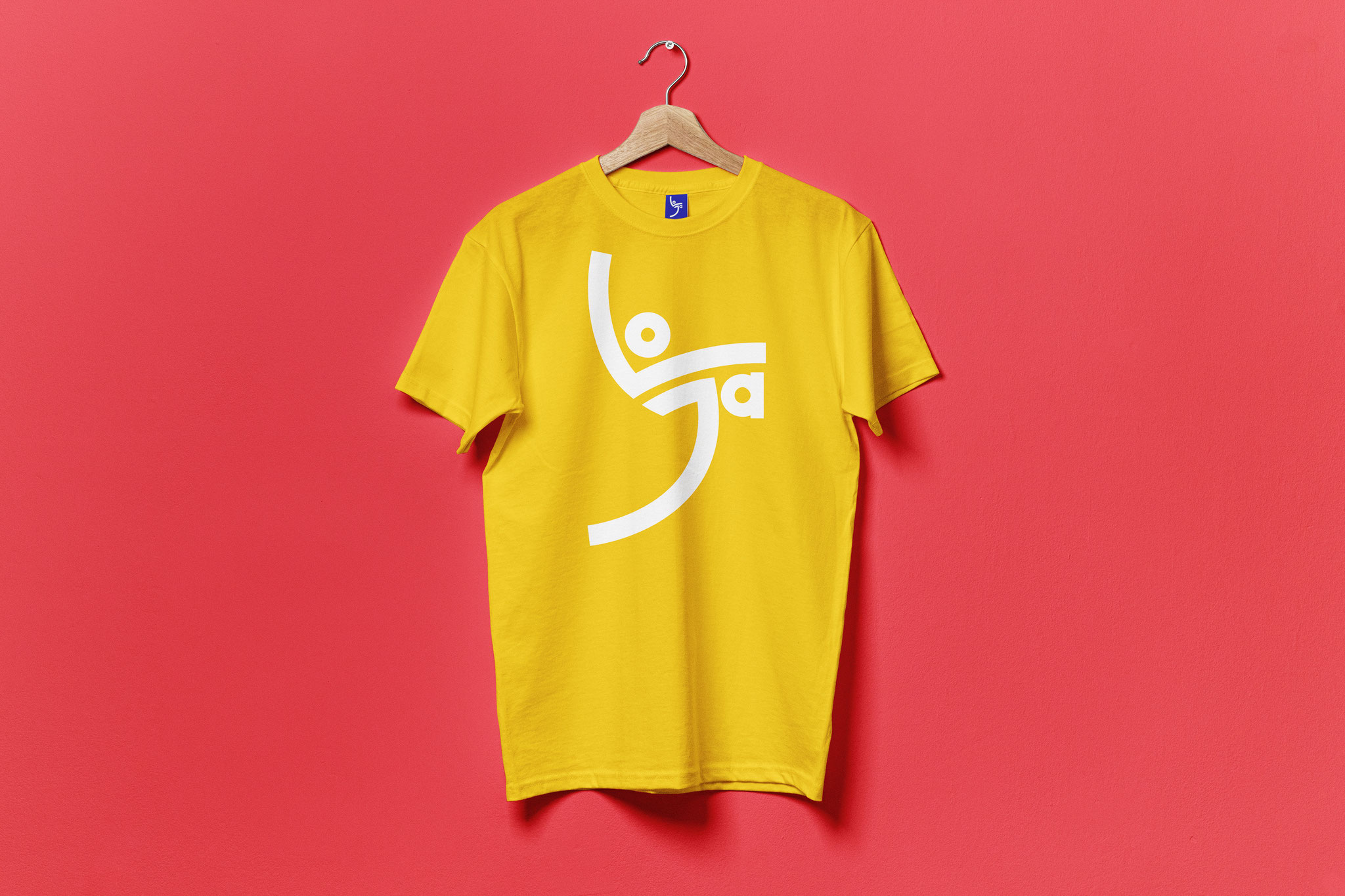
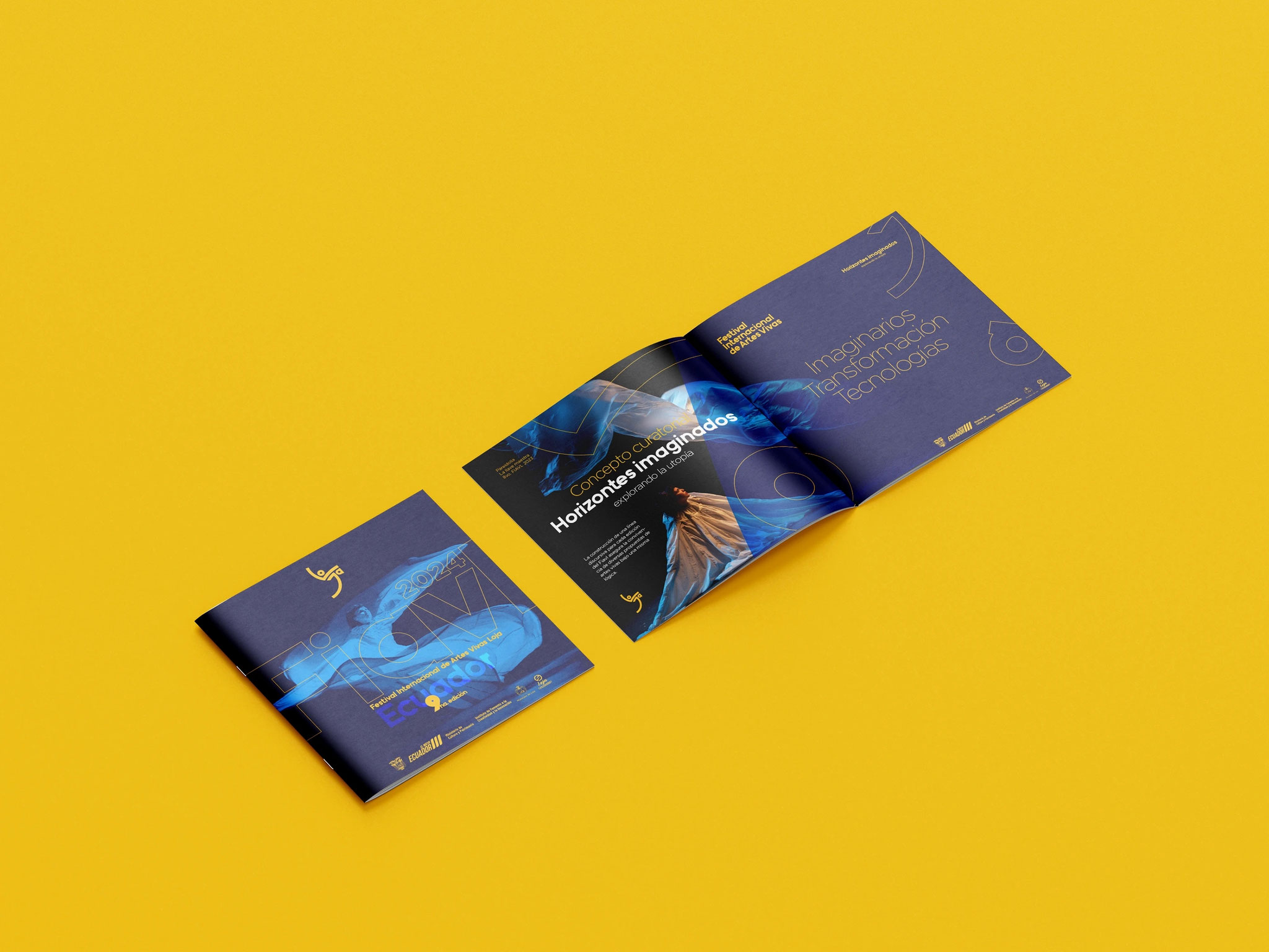
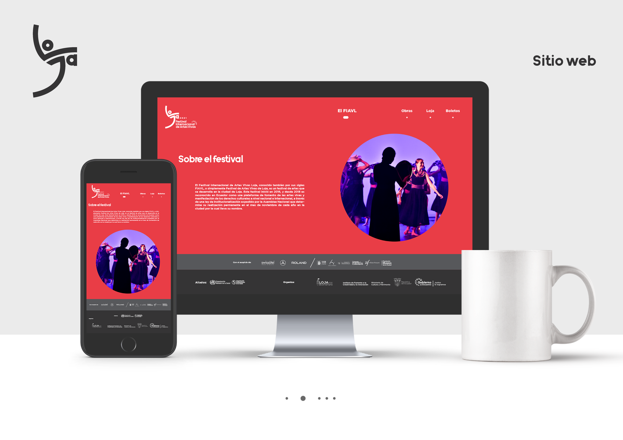
5. Brand Applications
The brand system was applied across multiple physical and digital touchpoints, including promotional materials, signage, editorial pieces, and digital assets. Each application follows the defined visual guidelines, ensuring consistency, legibility, and adaptability while allowing the identity to scale across different formats and contexts.


6. Outcome (What Changed + Impact)
Results
-
Brand system achieved better usability across festival media (posters, social, merchandise).
-
The modular approach enabled faster production of marketing materials.
-
Stakeholders reported improved visual coherence in all festival collateral.
-
Sponsors and cultural partners responded positively to the visual identity, aiding promotional effectiveness.
-
The design is currently in use and intended to endure as the festival’s core identity system.
Key Comparative Findings
-
Brand Recognition
-
The current identity shows a clearer visual hierarchy and stronger symbolic consistency across platforms.
-
Improved memorability and legibility in both digital and physical environments.
-
Estimated impact: +30–35% increase in visual recognition, based on audience surveys and media presence consistency.
-
-
Scalability & System Design
-
Previous identities were limited in their ability to adapt to subprograms and extensions.
-
The new brand system supports multiple programs (International, National, Municipal, Salud+Arte, FIAVLab, etc.) without losing cohesion.
-
Estimated improvement: +40% increase in system flexibility and applicability across formats.
-
-
International Visibility
-
Coinciding with the new brand, the festival expanded its international participation from approximately 12 to 17 countries.
-
Visual language aligned more closely with global contemporary performing arts festivals.
-
Estimated growth: ~40% increase in international representation.
-
-
Programming & Audience Perception
-
Expansion to over 300 cultural activities, supported by a clearer communication system.
-
Audience satisfaction indicators reported around ~88%, reflecting improved access to information and brand clarity.
-
The identity contributes to perceived professionalism and cultural relevance.
-