
"Choose to Create" Academic Fair - Social Media Campaign
Case of study
Context
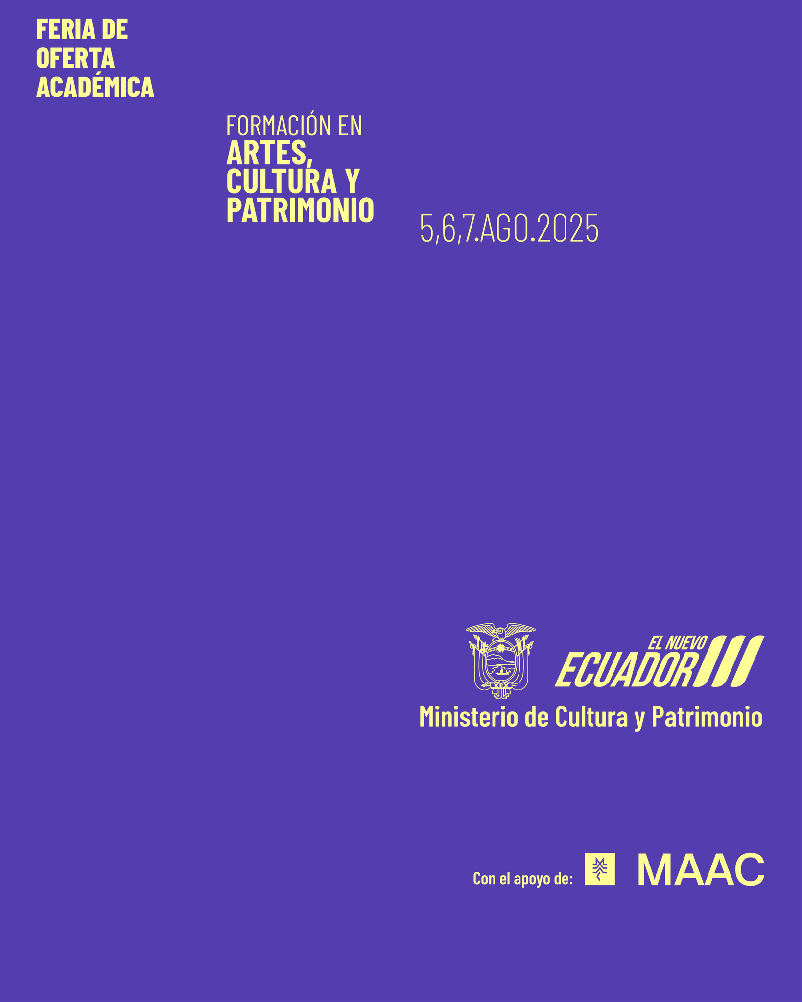
Date: August 2025
Duration: 1 month
My role: Senior visual designer
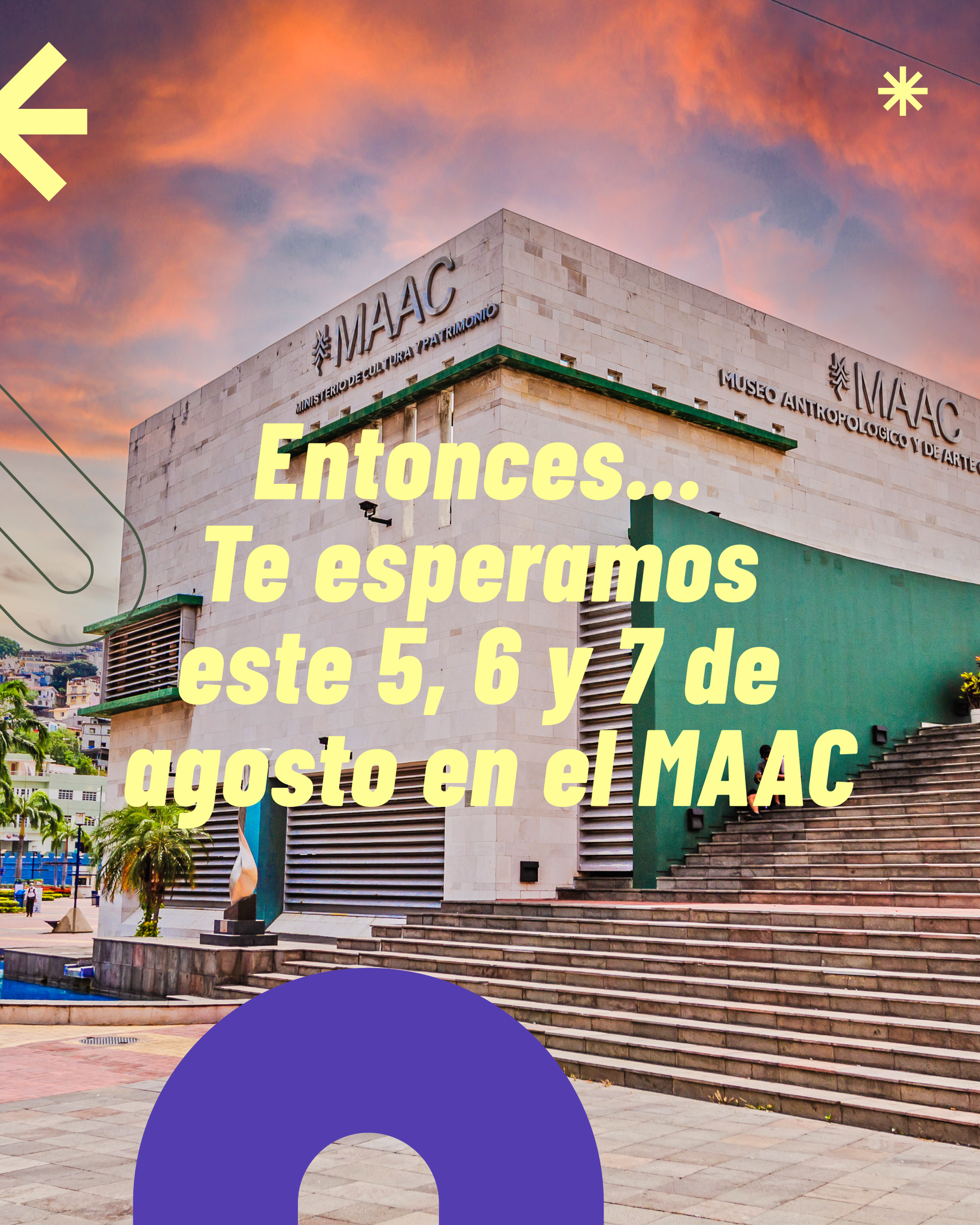
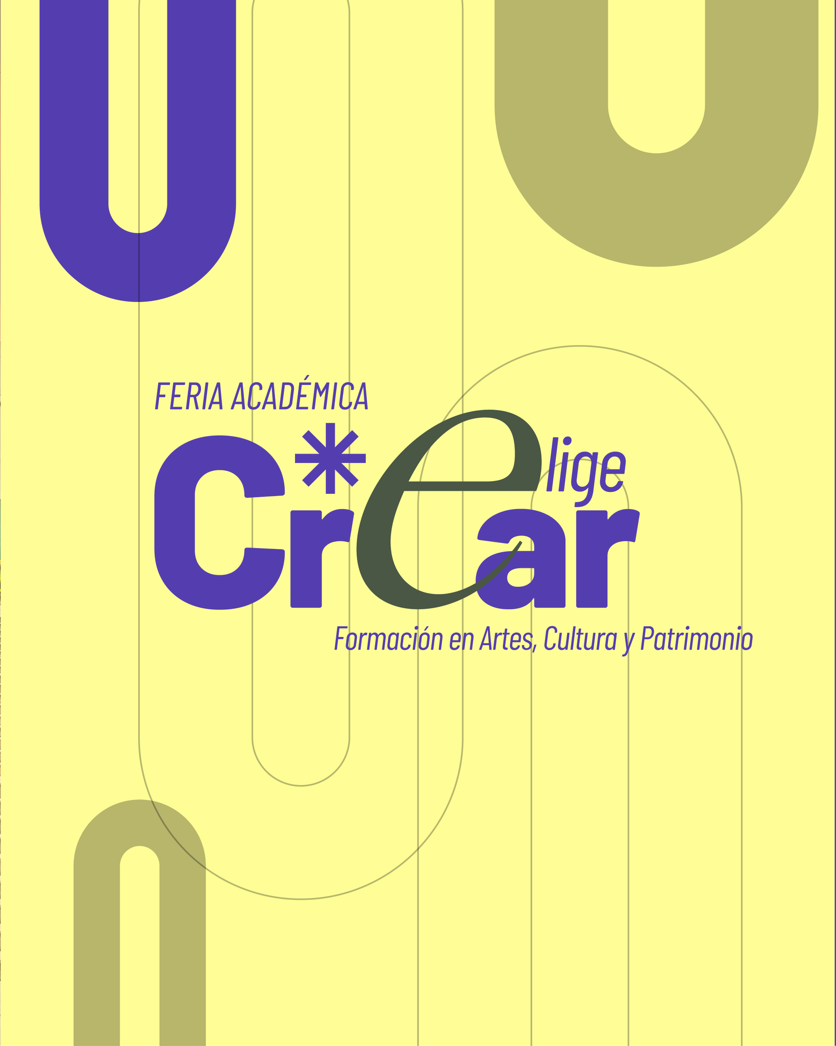
The Ministry of Culture and Heritage presented the second edition of the academic offerings fair specialized in arts, culture, and heritage, entitled "Elige Crear" - “Choose to Create”, held from August 5 to 7, 2025, from 9:00 a.m. to 5:00 p.m., at the Museum of Anthropology and Contemporary Art (MAAC), located in the city of Guayaquil. This initiative aimed to showcase a diverse range of academic programs offered by various Higher Education Institutions (HEIs) to high school students, young people, artists, and cultural managers from Ecuador.
The “Choose to Create” Academic Fair is a space for citizen participation that brings together a variety of sector-related activities focused on the dissemination, training, and awareness of the arts, culture, heritage, and social memory. It is aimed at high school graduates interested in pursuing undergraduate studies, as well as cultural managers and artists seeking professionalization through the attainment of an undergraduate or postgraduate degree.
Attendees had access to workshops, panel discussions, exhibitions, and artistic performances.
As senior designer working in the Directorate of Social Communication of the Ministry of Culture & Heritage, specificly in the Design Area, the insigth was to develop a social media graphic concept and guidelines that could be used as start point for other physical products in the fair itself, so my work was to lead the design of these products specially for dissemination on social media.
Design objectives
1. Increase Awareness of the Event
Objective:
Ensure the target audience clearly understands what the event is, when it happens, and why it matters.
Design implications:
-
Strong, legible event title hierarchy
-
Clear date, location, and organizer branding
-
High contrast and mobile-first readability
2. Position the Fair as an Academic and Cultural Reference
Objective:
Communicate that the fair is serious, academic, and nationally relevant, not just a cultural showcase.
Design implications:
-
Editorial-style layout (structured, balanced, refined)
-
Use of creative colors combined with cultural textures or patterns
-
Typography that feels artistic and academic yet contemporary
-
Visual references to research, dialogue, and knowledge exchange
3. Encourage Participation from Academic and Cultural Communities
Objective:
Motivate students, researchers, artists, and cultural managers to attend or participate.
Design implications:
-
Clear call-to-action (Attend, Register, Submit, Participate)
-
Human-centered visuals (people in discussion, research, creation)
-
Warm yet authoritative tone
-
Formats optimized for sharing (stories, square posts, carousels)
4. Perform Well in Digital Environments
Objective:
Maximize engagement and clarity in fast-scrolling social media contexts.
Design implications:
-
Immediate visual hook in the first 2–3 seconds
-
Minimal but powerful copy
-
Clear focal point and strong visual rhythm
-
Accessibility: readable text, color contrast, alt-friendly imagery
5. Create Continuity for Future Editions
Objective:
Establish a recognizable visual system that can evolve into future fairs.
Design implications:
-
Modular layouts
-
Repeatable graphic elements
-
A visual signature adaptable to posters, banners, and video
-
Scalable design across platforms
Key communication ideas:
- Discover careers that connect with the passion of future students.
- Explore the academic offerings of higher education institutions in arts, culture, and heritage.
- Access special benefits and be part of a program brimming with art and culture.
Process - workflow
1. The Innovation, Arts, Entrepreneurship Secretary (SEAI in spanish) from the Ministry of Culture & Heritage develops the fair proposal.
→
2. The minister reviews the fair proposal and approves it.
→
3. SEAI makes a request to the Directorate of Social Communication (DirCom in spanish) to develop a campaign communication oieces for the fair.
→
4. DirCom receives the request and designates the build up of the information brief and talking points to the Content Area.
→
5. Content Area send the brief and info to the Community Management Area to adequate this insights to the channel where it will be published (in this case, social networks) and send it to the Design Area for production.
→
6. The design Area receives the insights and brief, work in pair with the Community Management Area on a brainstorm to propose and develop a concept, graphic guidelines or content ideas for the channel.
→
7. The Design Area (thats me and the team) executes the graphic development and send it back to the Community Management Area to review it and sent it to DirCom.
→
8. DirCom reviews the proposal and approves or disapproves it.
→
9.1 If the graphic proposal is approved, the Design Area makes the necesary corrections to finish the products and send it to distribution.
←←←
9.2 if the proposal isn't approved the proces starts again in the point number 6.
→
10. Once the campaign is reviewed and aproved by DirCom, the campaign is published.
•
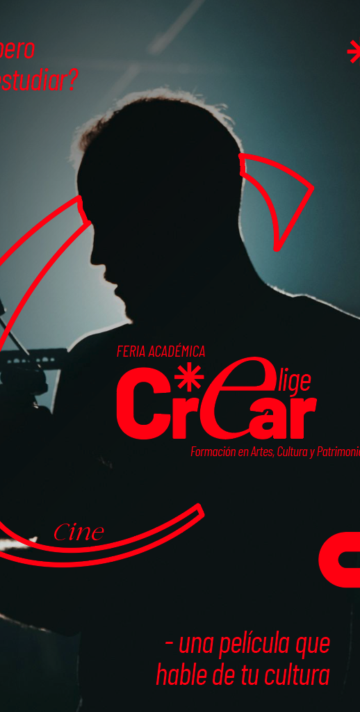
The design process:
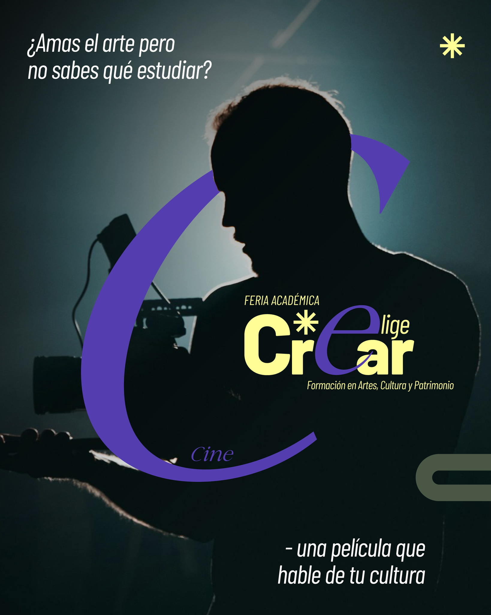
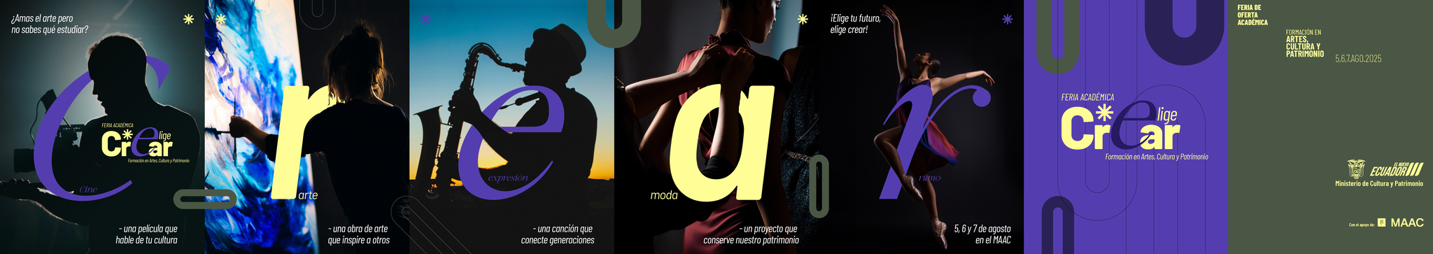
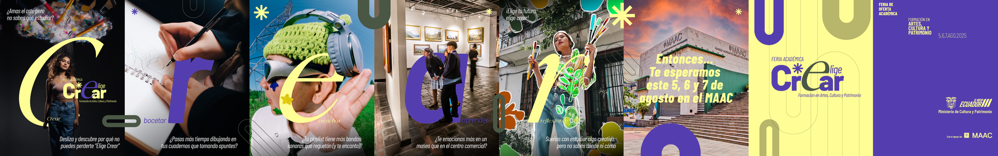
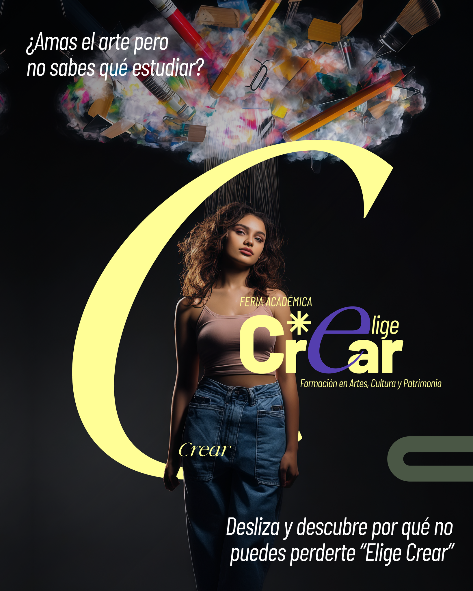
Step 1. Stablish the main concept and principal grpahic elements that will guide the development of all pieces.
↑ 1.1 In this case, the starting point was the logo for the fair, that was made by other memeber of the team and given to work in the campign.
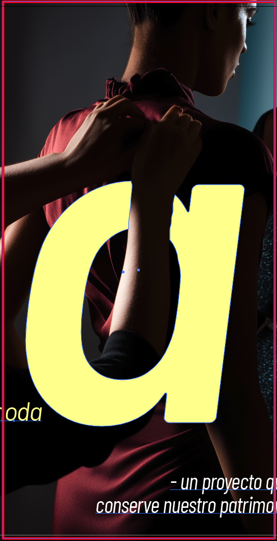
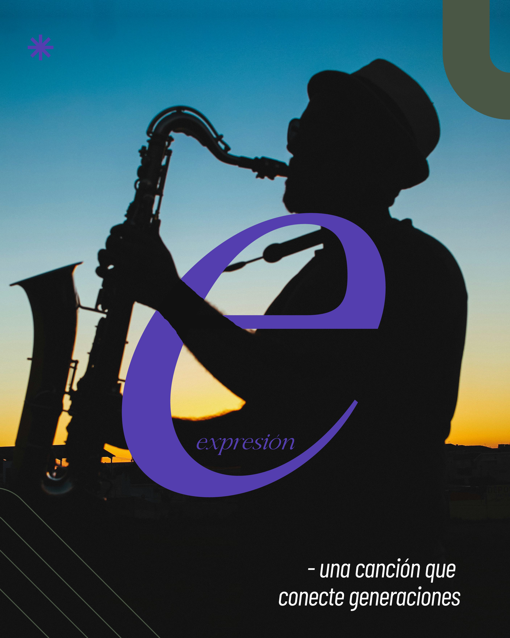
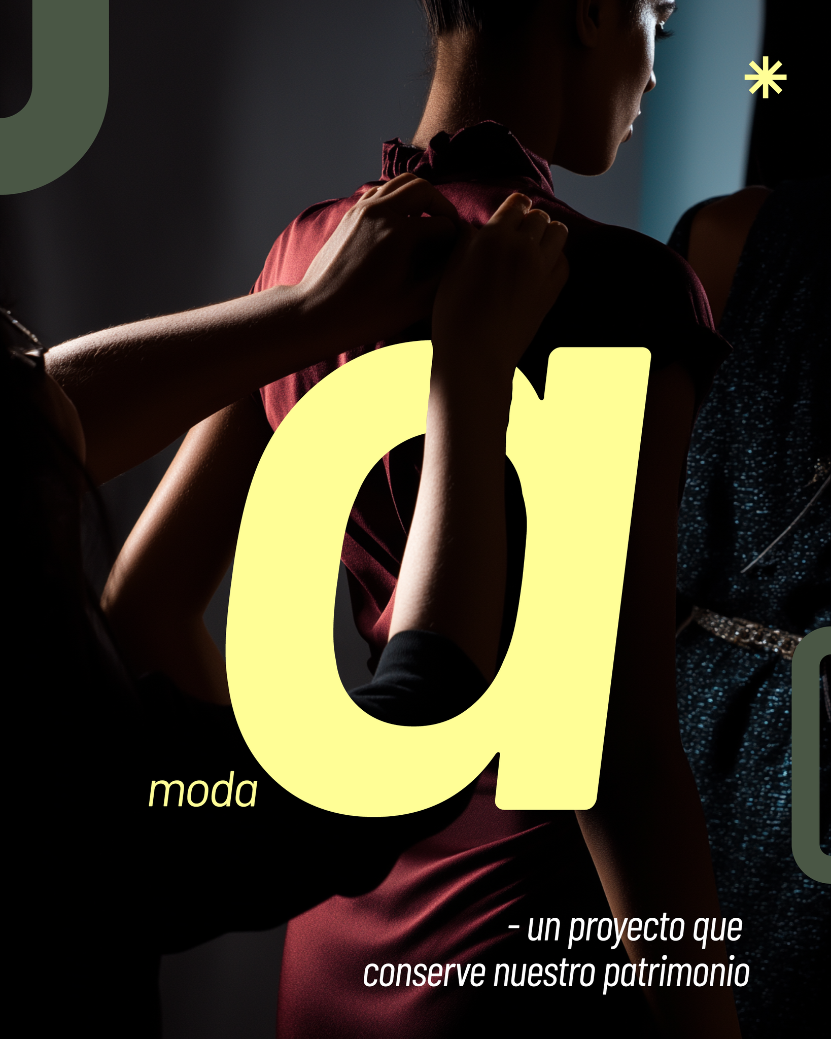
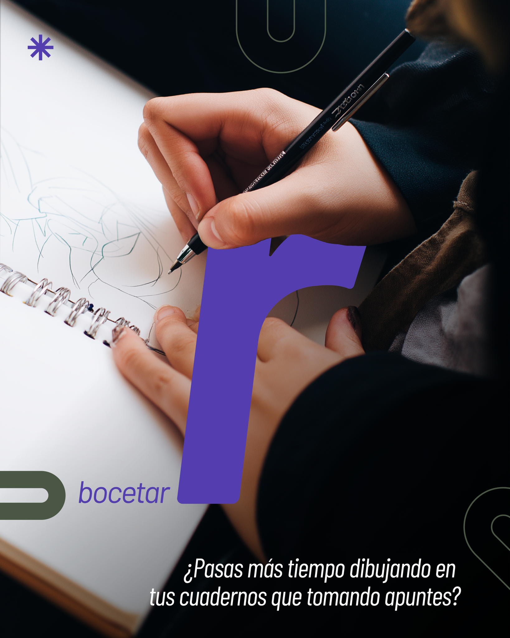
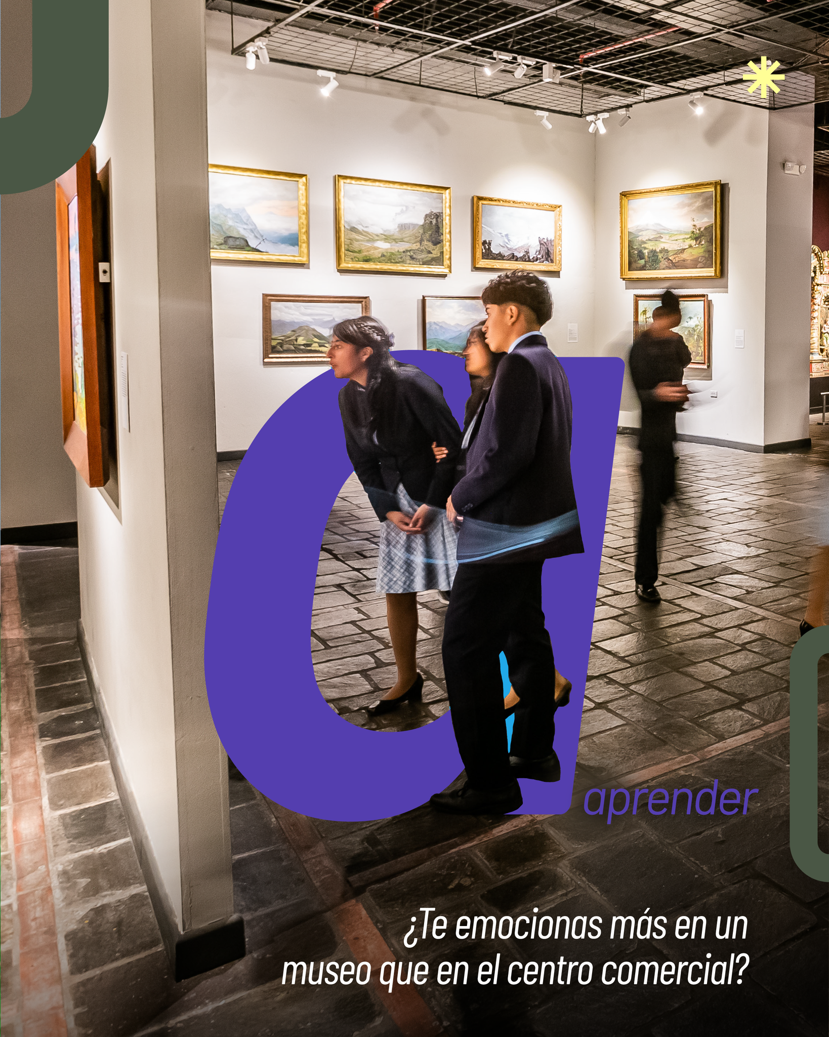
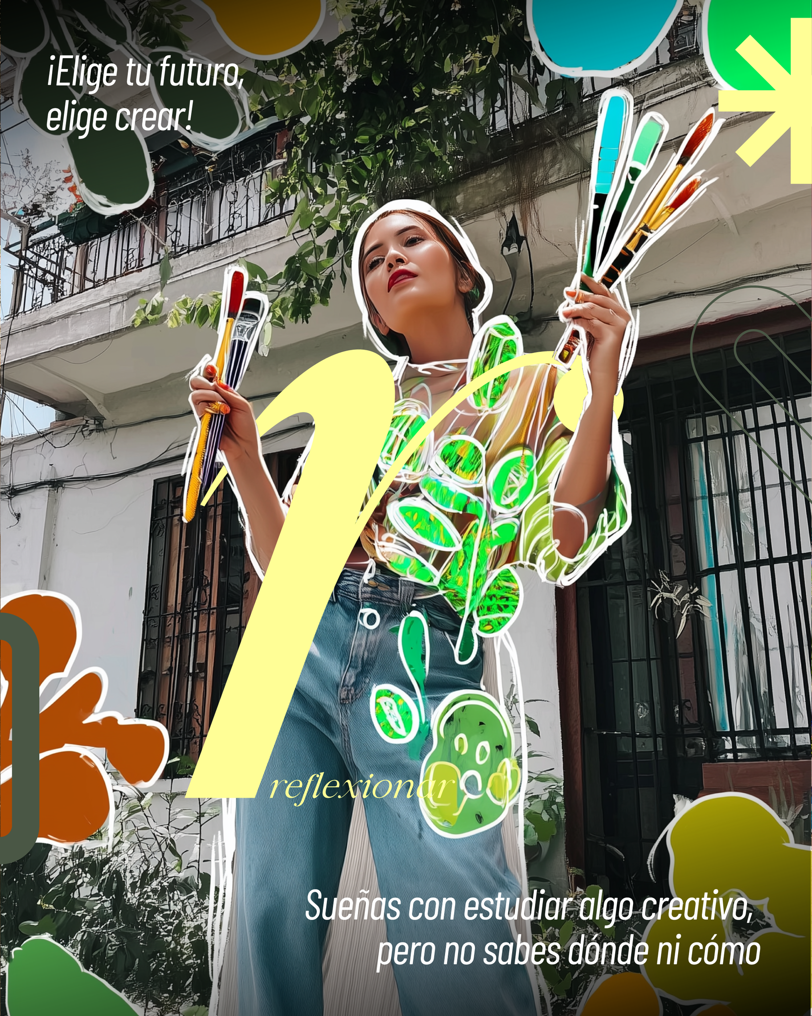
After brainstorming with the Community Management team and selecting the main ideas, the concept was to use the word “create” as the basis for designing a carousel, since creation and creativity define the scope and sub-branches of the profession and are central to professional practice.


→
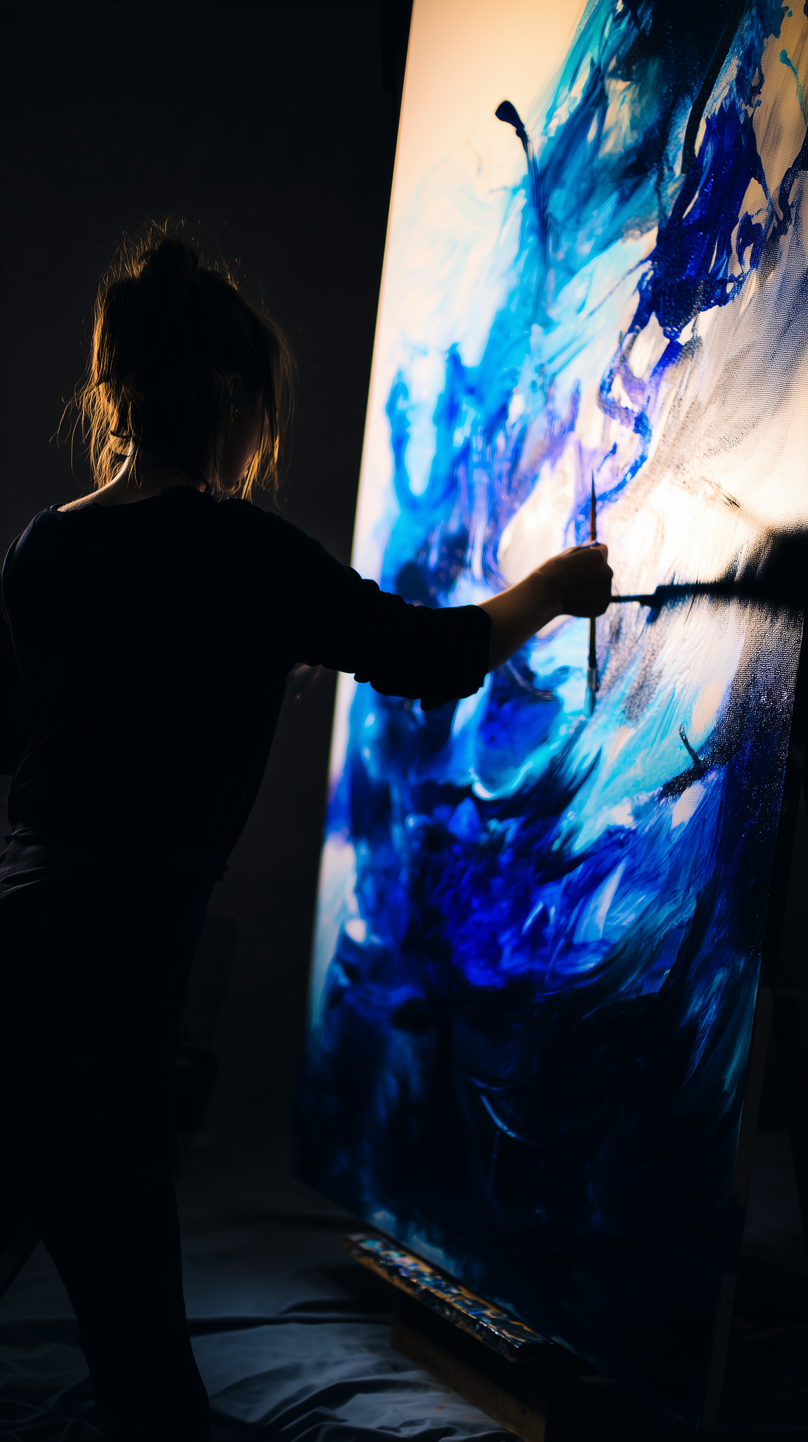
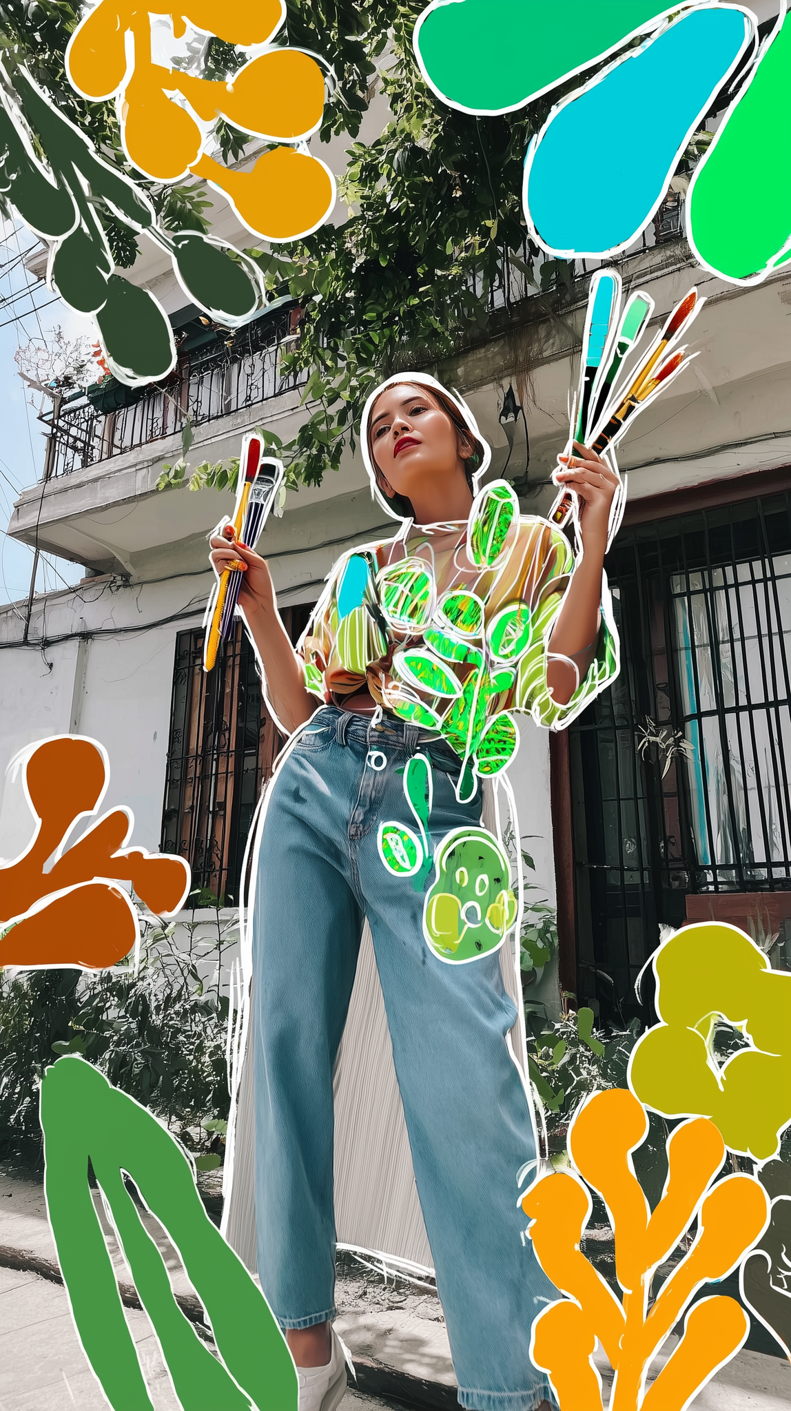
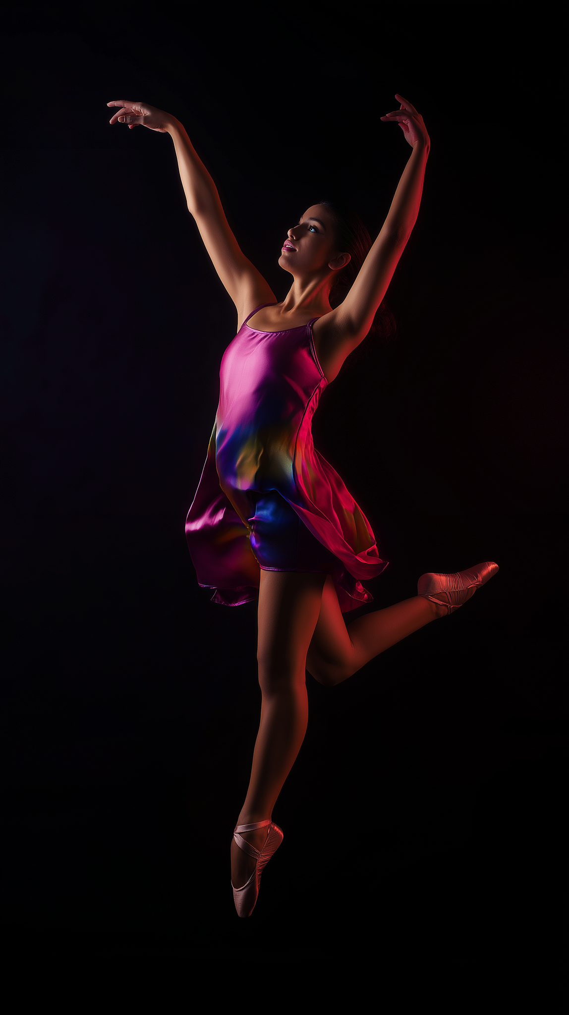
2.1 To obtain the necesary images for the background of the design I used mainly AI generative tools, specifically Midjourney to create based on concepts from the brainstorm.


Step 3. Search and analysis of typography in base of the content, the concept and information given.
For this carousel the type used was based on the brand made for the fair and the government brand guidelines to match and position the institutional identity.
↓

The image shows the two typefaces used for the design.
Step 4. Locate the information and graphic elements to verify white space, hierarchy between parts, heighs, visual weights.
In this particular case, the main resourse used was a mask between the images and the letters that formed the word "Crear".
↓
The image indicates the mask applied to the letter over the photography and the graphic elements located in the design.
Step 5. Chromatic analysis and test by applying the colors in base of color theory, the background, images, and guidelines.
To select and apply the colors fot the campaign the solitude was to use the chromatic created in the graphic guidelines made for the Ministry by myself.
↓

Here you can see the color palette chused and their codes.
Step 6. Shadows, sizes, readability, hieracy and contrast review and test.
↓
From the image, we can observe the elements united, as color, photography, typefaces, graphic elements.
Step 7. Reviwe of each individual art made for the carousel by the Community Mamagement Area and by the DirCom to to verify the content, the proposal, the messages, info, writing and typing for micro adjustments.
Step 8. The approved carousel is sent in high quality formats to publish on social networks.
The final result:


Metrics
The visual design developed for the campaign contributed to a measurable improvement in the event’s digital presence and audience engagement across social media platforms.
-
Increased overall engagement rate by approximately 13–17% compared to the previous academic fair edition.
-
Achieved a significant rise in content interactions (likes, shares, comments), particularly on carousel and poster-based posts.
-
Improved visual consistency and brand recognition, resulting in higher post recall and stronger identity association with the event.
-
Posts using the new visual language showed longer average viewing time, indicating stronger visual impact and clarity of information.
-
The campaign helped boost awareness and attendance interest among students, academics, and cultural institutions prior to the event.
Tools used


Midjourney


Adobe Photoshop


Adobe Illustrator